actually I think the only thing that could be improved would be the light. it's not that bad. It could be much worse, like a neon over the top casting some harsh green light...
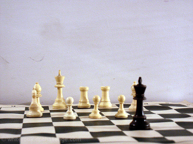
Spectacular. I'd forgotten to look at the brown til I saw the disqualification by DeSousa. This is bad in so many ways that it is truly a masterpiece. From the smudges and streaks on the wall, to the impossible position of two white bishops both occupying white squares....... man! The talent. Even Salvador Dali would be impressed. The matrix that holds the entirety of your work is even warped! Even a Hitchcockian appearance of your own moniker in the work. When I see your work I wonder why I even try to increase my scores and maybe win a ribbon. But then I realize that to be truly brown is a rare talent.
I could never make the cut. You're not one of those timid souls who fears scrutiny. This image was a perfect 640x480. Full sized. Right in their face. No small 160xWhatever for you. Even down to the technicals it's perfectly bad. F 3.8, it almost matches the score. Whoever heard of an F3.8? Wow. I'm glad I got to see this. I can tell my grandchildren that I knew you before your portfolio toured the country, and the world. My hats off to you. Well, anyway, if I had a hat. (oh yeah, I noticed the slightly whiter pawn at king 3 and the knight beside it. Man!)
Although this was a cool concept, it seems like the pieces are a little out of focus (especially the black king), and the dust/smudges on the background are somewhat distracting.







 Add photograph to your favorites
 Add photographer to your favorites

 Photographer found comment helpful.


