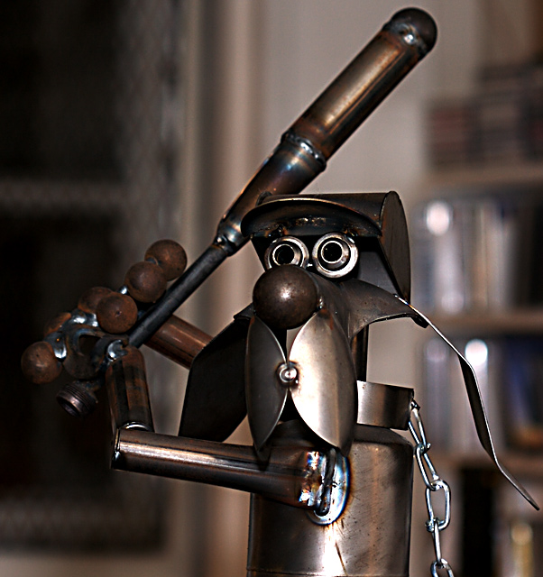
meets challenge, but sort of a flat image. background is blurred, but not enough to take it away as a distracting element and not interesting enough to add to the image as a whole. lighting isn't bad, but could be better on the left side. sorry - 4.
congrats to the artist, 1 idea towards the photographer: if you can chose the background (and the statue isn't too heavy) do so. That picture lives on reflections... you could improve that.






 Add photograph to your favorites
 Add photographer to your favorites


 Photographer found comment helpful.

