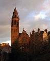
A couple quick comments, which you've probably already heard but just in case in you haven't: a "level" picture is very important! Use the "Rotate Canvas" tool in your photo editing program to try and get the horizontal lines parallel with the edges of the frame if you have a hard time getting it that way right ouf of the camera. It also looks like you may have cropped off the top of the steeple. NeatImage would help to reduce the grain in the sky. I like the time of day you chose for this photo; it adds interest. I just wish the upper windows weren't so "blown out", but it is very difficult to capture an image like this with a large dynamic range.
Looks tilted slightly to the right, but this image has a wonderful glow to it,and the symmetry is very nice. The church is very interestingly lit and keeps my interest and sparks my emotions.
More light on the front of the building would have made this more effective I think. If it was a long exposure, perhaps using a strong flashlight and shining it (kinda a painting thing) would have helped to bring out some of the details. Or, get another camera and use its flash to illuminate the building more. That way, perhaps you could have cut back on the exposure time and not overexposed the lights.
Nice church, the statue in the front without light works very well but the lights in the towers are a bit too bright compared to the rest of the shot. Are they really that bright? The sharpness is a bit lacking in this shot but the crop is nice overall. A 4 to start
This is one of the trickyest shot to succed at. The only way i know to have a nice balanced light throughout involves working with two different shots; one for the bright lights and one for the dimmer lights and then combining them in a photo editor. (not DPC legal...) be carefull with tilting horizons
This is almost spooky with the bright burning light blaring out of the towers and that shadowy fingure in the front. I like the colorful leaves. Some way to tone down the light inside the tower?
This must be a beautiful church but I don't think it worked really well as a night shot. The windows that are lit are completely overexposed and the parts near the top are totally underexposed. The bottom half of the picture is a little better than the top portion.
The crop is a little tight on the top and bottom for me. The exposure is really hard to call on this shot due tot he bright lights coming from the steeples. Good shot over all.
The light at the bottom should either be in the shot or out of the shot- where it is located at teh minute it is drawing my eye away from the shot itself. the brick work could do with being a little lighter ( bringing up the levels ) and the church spire is just cut off the top of the shot which again spoils it a little. Overall a great image and I like the way the statue has a good silhouette ( would look better with the levels Idea I mention - I think ! ;0) 6
Though I love the look of the windows against the dark background, I can barely make out the outline of the steeple, and for me, the photo is just too dark overall to be able to appreciate any of it! I would love to have been able to make out more of the architecture of the building.






 Add photograph to your favorites
 Add photographer to your favorites


 Photographer found comment helpful.


