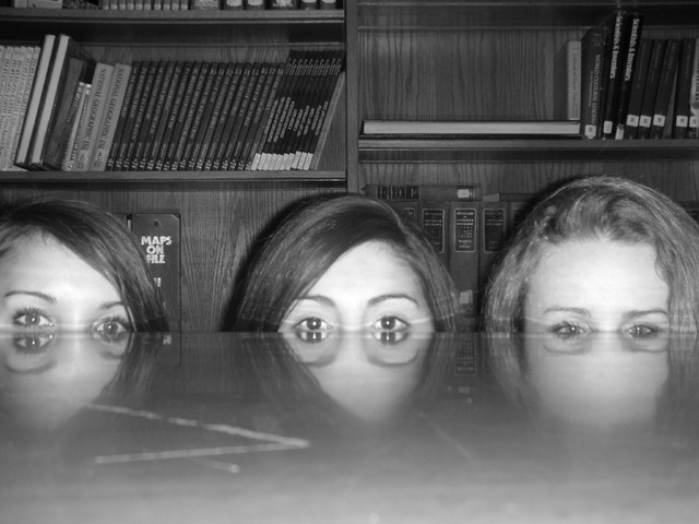
I love the idea of this one - but the conversion to b/w is not very good. Was this a direct conversion, or did you use desaturation using the channel mixer?
On my monitor it looks like the focus was a little long (on the books). I think this would have been a very good shot but the lighting is harsh and the table cutting through their eyes looks weird instead of interesting. I think if you could have had them come up a little so they had 4 eyes it would have been better at least in my opinion. Idea and composition are both great.
i like this alot, the only thing that bothers me is that there seems to be a scratch on the table top or something in the left side of the photo.... im just picky though...
I think you were onto something here - Maybe just a little more technical attention could have made this a much better shot. For constructive purposes - The scratch or mark on the left of the table should be cropped off or better still re-shot on a better table. The Maps wording behind the girls head on the left is really distracting. Also just making the girls a little more together would help with composition. A great idea though.






 Add photograph to your favorites
 Add photographer to your favorites


