This looks almost like another shot in this challenge, only a different eve under the roof and a different statue on the lower roof, LOL!
I like this one very much, the contrast is a bit soft to me and the shadows on the bottom room are a bit distracting to me. I like the shadows created but the heavy black border is a bit too much, if it was a little lighter. The cropping is very well done. Started at a 6 but am going to an 8
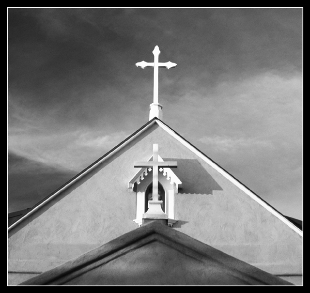
Great architectural shot! Love the black and white; this almost looks like a drawing or painting as opposed to a photograph. This shot is very visually appealing, and moves the eyes fluidly throughout the photo. The lights and darks are all balanced well with a wonderfully dynamic composition. The longer I look at it, the more I like it. I sure hope people take the time to really look at this, it is terrific.
Is this in Albuquerque??? This reminds me of the old (very old) Catholic church down by Tiguex park.
What an awesome photo... That sky looks incredible in this b/w format. Your use of symmetry is really powerful. I can't wait until the challenge ends so I can see where this was taken!
Wonderful work - same guy as the Grado shot, I'd guess? and not just from the Italian title ... True sense of shape and tonal contrast here. Beautiful, beautiful work. Might be little too complicated an image to rate a ribbon on dpc, in the sense of it's almost abstract quality, it's concentration on the formal, but I do hope not.
Returning: seems to lack a little sharpness, though that might only be to avoid jagged edges.
The tones, the composition, and the shapes really appeal to me in this shot. Great minimalistic, powerful image.The shadow being the only bit of asymmetry works very well.
Nice and dramatic - good abstraction from the building, like the burnt out cross and the light makes some interesting shadows. I think there must be a time of day when the front cross would be shadowed on the rear building and that might make an even stronger image
There is a wonderful feeling of texture in this shot, and I think the black and white and contrasting grays really add to that. The composition is great with very strong lines. The dramatic sky compliments the tone of the building. This is a very classic image.
Interesting concept, the perspective you have chosen is also good. Did you climb up a tree or something to get the top of the roof at the same height and level? I find the composition is leaning a little to the right however. If you put a ruler at the bottom of the photo following the horizintal line you'll see what I mean. It is quite minimal actually, but the eyes pick it up quickly.
One of my top five this challenge. Reminds me of the "grace" picture in the Utah salt flats. I won't be a bit surprised to find out it's the same area. Unlike some of the others with centered church-roof compositions, this has subtlety to it and obviously careful lighting and attention to detail.





 Add photograph to your favorites
 Add photographer to your favorites

 Photographer found comment helpful.


