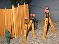
Good composition however, DOF is shallow and the picture appears quite grainy. The stark black upper right corner seems a little distracting. All in All this is a worthy of note for the challenge topic.
REALLY GREAT - I can see the time and effort put into this one. It's simple - but not. I definately like the composition - the usage of lines. The choice of dof is also really great - it makes the primary subject REALLY stand out (isn't that the point of dof?). Great achievement of black background. At first, the extra contrast (if that's what it is) stood out as a negative, but as I really look at it, I think it adds more the photo. GREAT WORK 9 Ruthann
Great patterns. I like how the front pencil was placed in opposite of the other pencils. you had very good spacing in the bottom pencils. Lighting is good and focus and angle are good. Sharp focus on the front pencil and soft focus on the others looks really nice in this case. I am curious about the very bottom pencil and why it is cut off at an angle like that. great job and good luck in the challenge.
I like the focus, and I even like the slight grain. The thing that distracts me is the black piece covering the last pencil at the bottom... it really disrupts the pattern.







 Add photograph to your favorites
 Add photographer to your favorites


