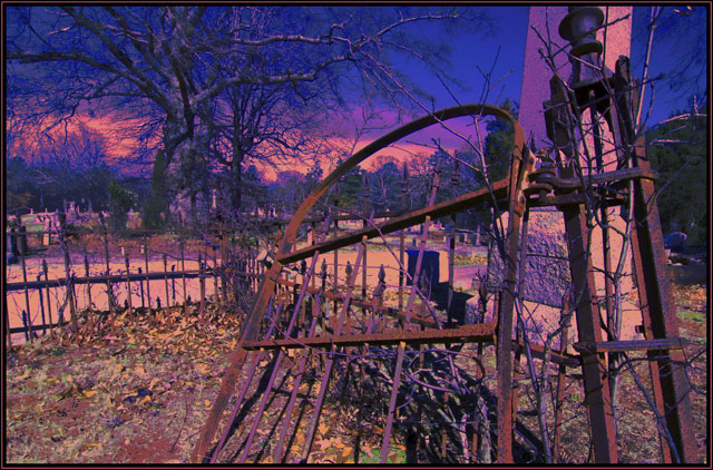
One of the photos taken for the exit challenge, I missed the deadline for submission, so thought I would submit in Free Study hoping for some critiques.
Statistics
Place: 533 out of 559 Avg (all users): 4.3618 Avg (commenters): 4.7143 Avg (participants): 4.3089 Avg (non-participants): 4.5862 Views since voting: 684 Views during voting: 203 Votes: 152 Comments: 9 Favorites: 0
Interesting but cluttered photo. One word of advice: Simplify.
Next time you look at any photo, observe where your eyes move to. Analyze your eyes movements. Generally, in good photos, your eye is lead from one object to the next in a circular motion all around the picture, and kept inside the picture frame. The brain searches for meaning in the picture, but doesn't like to be confused, by subjects leading your eyes nowhere, or out of the picture The picture should feel "coherent". The clutter in the bottom of the picture ?Brambles, are confusing and not pleasing. The pinkish stone column, doesn't make much sense until you realize it is a monument in a graveyard, but the evidence of the other graves is too small. Sorry, I had to work too hard to see them, even then I cant be sure that it is a graveyard. The background trees are green and/or blue, those colors are confusing. I like the big tree, but the top is cut off so leads the eyes out of the picture. That tree itself may have made an interesting photo, I like what I see of it. The top of the gatepost is cut off, again leading the eye out of the picture. Try not to cut ends of things off. I also really like the rusted gate, the rails and the foreground pile of leaves. I would have concentrated on some of these details, and tried to find a simple composition.I like the rusted spikes, I may have looked for a repetitive pattern in these to simplify the composition. You could have cleared the twigs and brush from the railed in area, that certainly may have helped to simplify the foreground a lot. By changing position I think I would have tried not have the large Pink column on the right in the picture at all. I would try an find one focal point to help the eye to get back to. In this picture, I cant see one. I'm not sure the false color add to the image, to me it confuses not clarifies. What do you want the picture to say to me the viewer? Will it get across to me what you feel when you take the photo? Just my 2 cents, for what its worth. Each to his own. Enjoy.
My attempt at a surrealistic image failed miserable. I would love to hear some critique on the same photo processed differently or does the photo fail in composition and having a clear center focus?







 Add photograph to your favorites
 Add photographer to your favorites

 Photographer found comment helpful.


