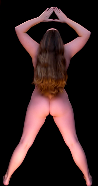
I did some dodge, cropped, resized, neat image, sharpen, photo contrast overlay, adjusted levels, burned.
Is there a tutorial on airbrushing?? Sounds like a neat processing tool! I seriously have no idea what that comment meant but I am guessing it could have been used to make this even better :) Thank you! You made my day!
For everyone else, I believe my monitor may be a bit off! Thank you for bringing it to my attention! :-) And, thanks for the votes and comments from everyone!
Statistics
Place: 73 out of 121 Avg (all users): 5.4784 Avg (commenters): 5.7586 Avg (participants): 5.0119 Avg (non-participants): 5.5816 Views since voting: 4729 Views during voting: 1320 Votes: 464 Comments: 38 Favorites: 1 (view)
For everyone else, I believe my monitor may be a bit off! Thank you for bringing it to my attention! :-)
I think you may be right. I noticed it is rather pinkish in Desktop too. I think if you had brought your hands down closer to your nose you would have two more recognizable triangles inside your elbows too.
Nice concept though, and nice form. Gorgeous hair too! I can't believe this shot did not break 6.
Lovely image, I love the triangles. I might have lowered the tips of the thumbs down onto her nose to create two additional obvious triangles in the image. I may have also narrowed the stance to elbow width to get a bit less negative space from the elbows. However the image is quite lovely, and hope it does really really well. Good luck.
allthough the photo seems to be fine, there's something that's bothering me. I think it's mostly the pose, it seems a bit unnatural. the lines around her body also look a bit oversharpened, while the rest looks like too much neat image.
I like the repeating patterns, but I'm not a fan of the soft look. I can't tell if it's OOF or if you've overly NeatImaged it. The pose is a little off center at the shoulders and head. Great concept and, with a little tweaking, could be a wonderful shot.
Great idea! Love the composition. The models hair works just perfect for this pose. I am left wishing that the lighting were either more even, and/or just a tad more subdued. A nice shot though. Good job!
Interesting idea, but really needs better symmetry to pull it off. I realize that getting the model perfectly straight is hard (especially if this is a self-portrait!), but a bit of liquify postprocessing could have fixed it. Also, although the lighting is good, focusing the light on her beautiful hair would've been even better.
(I have decided that there are other persons in this challenge that I recognize, and that you deserve consideration just as much. Also, I'm sure everyone pointed out the color cast - I would be happy to share a monitor calibration device... as soon as we get one! lol)
I can't quite tell exactly how many lights you have used, but this dramatic pose is done well, without overpowering the viewer. You have obviously worked very hard on this, to create the hair accents, lighting the tops of your arms, and even correctly capturing the waves of your long shining hair in a beautifully flattering manner.
I have watched your work improve, almost daily, in the short time you have been submitting here and your hard work is easy to see - you've improved very quickly, and you should be proud of yourself!
Great job and, yes, yer butt looks terrific! Congratulations on a picture well done.
I quite like this image. just find it seems a bit over processed and pink I Copied this and converted it to B&W using a gradient map & I think it works much better.
Lighting is OK, maybe a bit flat.
I think if her hair were a liiiittle shorter or her head was angled down a little more this image would work a lot for me. THere is one more "triangle" just above the buttocks which is being hidden by the hair... or at least under-represented.






 Add photograph to your favorites
 Add photographer to your favorites

 Photographer found comment helpful.


