Hi new critique member here to give some thoughts on your shot, hope they help...
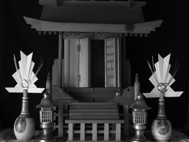
The tones in this are wonderful ranging the whole gammit, from black to white and lots in between. This is a feeling of quiet ond elegance that you have capture thru your lighting choices, overall I think this is a good image, and a creative subject (it is great to see varying takes on a topic!! : )).
My possoble criticisms would be it is very tightly cropped on the top, would be nice if there was a little more space up there. The central compostion could help to suggest the centralness of this sacred place to the photographers life.
My last thought is somewhat naive, this may be an exact representation of a Shinto altar, which if is this criticism is of questionable use, but the shot is a little crammed, it feels like their are a lot of objects in it to focus on, I think the b&W color scheme helps to unify it,some possible solutions could be to only include part of the altar or perhaps some additional black background space would really give it some breating space.
A good sharp, clear image, with great lighting and subject.
happy shooting
Nicely done! Good tonal range and nice fill of the frame. There is a very slight clarity problem for me, though. You might want to add just a little darkness to your neutrals, or play with curves just a little. Nice work. 8
Very nice shot, good composition, well balanced and very nice clarity. But the brightness and contrast, more the contrast is a bit bothersome to me. I like the subdued light but it really doesn't grab my attention and make me want to examine all the details of the shot. I started at a 4 but am going to a 6 for the strong points.
I love the near symmetry and the b and w. There is some glare on the vase, and the whole picture is unnecessarily blurry. But other than those small complaints, this is the most interesting photo I've seen in this challenge so far. Very very nice-10.
I'm not sure the very low whites level is helpful to this shot: you haven't really got any brighter than the background grey of the site, and that reduces your options in the black anf white field enormously.
would like this better in color. the wood tones would be very warm and help the sacrosanct impression. also a slight rotation to the left of about half a degree to make the tabletop perfectly horizontal.







 Add photograph to your favorites
 Add photographer to your favorites


 Photographer found comment helpful.


