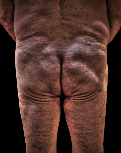
Tone mapped from a single RAW exposure, exported to CS2
Rotated and cropped. BG selected and leveled to black. Hue/Sat adjustment layer in colorize, faded. Gothic Glow layer, faded. High Pass in overlay mode. Fairly aggressive vignetter added. Resize, sharpen, save for web.
******
If ever an image I have submitted is doomed, I swear I believe this one is. But I wanted to do a completely unromantic view of the human body "as is", and I think I have succeeded here. The tone mapping is integral tot he vision I had for this, as it emphasises every single "imperfection" of the form.
Statistics
Place: 105 out of 121 Avg (all users): 4.6083 Avg (commenters): 5.2973 Avg (participants): 3.9506 Avg (non-participants): 4.7500 Views since voting: 3614 Views during voting: 1538 Votes: 457 Comments: 54 Favorites: 0
Ah - this was you: are you familiar with John Coplans' work? This has nuances of some of his portraits and self-portraits. Don't I wish we could have had a truly "Unromanticised Nude" Challenge, or Nude Abstract. The plastic nudes leave me unmoved...obviously I'm a minority vote. But the real beauty of flesh as it takes on life, is a powerful subject. A bold, brave entry.
Conceptually I like the idea Bear, but I'm confused by your approach. You suggest that you wanted it to be real ("as is") but then you added the completely unrealistic processing. I understand the idea of emphasizing the imperfections and all, but the tone mapping/oversaturating/gothic-glow etc just ends up making it look like a cheaply produced poster; I think it actually lost a lot of useful detail through the tone-mapping.
Of course, we both know that 'real' images won't have the same mass appeal as the synthetic ones, but you went into it fully prepared to accept that as evidenced by your comments.
On balance I think you achieved what you were after, and I concur with the others that it was a bold statement - certainly against the grain.
This wasn't intended to be criticism - just critique. My opinion's just that - my opinion. I've been wrong many times before ;)
Initially I see a interesting clinical picture. I have no pro/medical experience or have had opportunity to observe many medical files other than my own, however it seems to have a quality like that.
and some dpc humor....
I thought of a silly word association which you may find to contain some mild amusement.
I use to see photos like this in the books of great photographs of all times. Congrats Robert. You are far way from all of us. Keep on the excellent work.
I like the idea of this shot but I'm not so keen on the PP. I think it's the colorization that put it just over the top. I like the tone mapping but would have liked to see it kept more "real". It's still a cute arse by the way :)
I'm really trying not to react to this on a purely aesthetic level, because I understand that a "pretty" picture was not your intention. But I still think this falls short on a couple of points: First, I think this would have been a more interesting and more powerful without the heavy-handed post processing. Second, while I think you intentionally wanted a stark and straightforward composition, the composition on this could still be improved. I would have either liked to have seen something tighter, or a more full-body shot (or perhaps even just without the arms on the side so that there was negative space all the way up both sides). All that said, I've bumped up my rating. If nothing else, you deserve something for entering a shot that has such a likely chance of getting panned.
I'm not overly happy with the appearance of the processing on this photo. It perhaps could of been made more interesting with a less centred crop also?
Great idea, but for maximum impact I'd really want all of it to be perfectly sharp. The skin texture is the key element in an image like this, but some of it is lost due to the blurry focus. But the lighting, colors, and composition are all good!
a brave and beautiful image. i just wish wish wish the focus were better. i'd love to give you top marks to counteract all the people who will socre you down for not showing fashion model skin...
You brave, bold soul! extra points for doing something I value and have yet to do for myself (to be unconventionally daring).
I will assume that you deliberately left the skin texture to look like the foreign redness of Mars, as it adds to the effect and intent of the photo (for me at least)
:)
I appreciate what you're doing here. However,the butt, which is the focal point of the photo, is out of focus. The color is disquieting to me, as well as the blacked out area between the legs.
This is probably the hardest image to comment on as I hate it. But in hating it I love it as it brings up emotion. The processing in creating the black is a little badly done between the legs. Respect for posting it.
This is just a brilliant portrait, but I just wish it were more in focus!!! It's been smoothed or blurred or is just OOF..? I would have given this such a high mark if it were clearer.
Interesting message. I'm afraid I don't really like the processing done to this image. The clipping is quite noticeable on the inner upper thighs. There seems to be a strange blur/softness, but maybe that is just from the processing.
Oh dear... hehe! This would be a better shot if it were more in focus, but I really love the concept. It is an interesting change from other shots, and a good reminder of the how quickly time passes by.







 Add photograph to your favorites
 Add photographer to your favorites

 Photographer found comment helpful.


