"Blue Baby" is very cool concept for the Nude challenge.
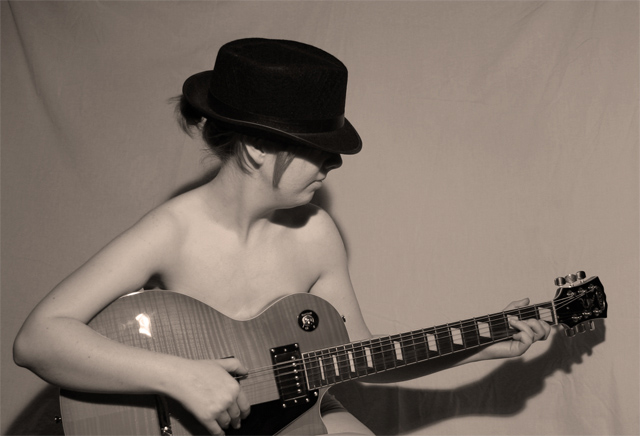
I think that the idea is fabulous and what a wonderful girlfriend to model for you. I defiantly voted for you on this one for the creativity. I think to make the photo scores some what higher you might try and have the background tight. The subtle wrinkles and sag on the left hand side are kind of distracting. I like the way the lighting allows a soft shadow to be cast onto the background. The lighting is a great piece, the only thing I would say is to some take the shot without the glare off the guitar. I think I like the tint of the image it gives you something a little different from bright colors and black and white. I am surprised with the title you didn't want to give the shot a small blue tint, but then it might look too cold. Also you did a great job with the focus and composition.
The lighting on this shot could be much better. Your model is too close to the background creating harsh shadows and exposing wrinkles in the background.
One simple thing could have improved this photo a lot - move the subject much further away from the background. That way you wouldn't have had the shadows showing up on the background (which emphasise the harsh lighting), and also it would have been easier to hide the imperfections in the background (the folds in the corners - Gaussian blur in photoshop could have done that too though, this was an Advanced challenge).
I like subject, props, and the general idea of the shot. I think the lighting is great, but I think the background would have paid off better with black. The model is kinda pale, and the excellent lighting would have still made the hat stand out from the background. That would have also eliminated the distracting shadow of her arm and right behind the neck.
There are a few things that could improve this image.
1 is the crop. If you cropped a tiny little bit lower, then the finger wouldn't be cut off.
2 Is the lighting. On camera flash is a big no no. even if it is high.
3. Get your model away from the background, at least 2m or 6 feet then you won't see those ugly shadows. And you can throw the background more out of focus.
4. Those folds in the background make it look like a hastily rigged up blanket hung up. (Though I'm sure it isn't)
5. Show us the eyes. Seeing the eyes in an image adds a lot to a picture like this.
The photo seems a little flat to me - little emotion, not very interesting. A good nude photo often seems to have high contrast and good shadows to exaggerate a beautiful form - this doesn't have that.






 Add photograph to your favorites
 Add photographer to your favorites


 Photographer found comment helpful.


