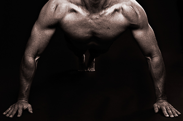
Cool idea! Great skin texture. On my aging LCD monitor, the feet don't look connected to the rest of the body unless I tilt the monitor. If it's not just my monitor, then I'd suggest a slightly lighter background would have helped, by providing a subtle outline connecting the feet and upper body.
I can't help but notice that this was shot slightly from the left. The feet don't line up and the lighting is different, which ruins the symmetry. Other than that very impressive. Love the tone and the texture.
I like this lighting and exposure. I also like the symmetry and composition. The focus and detail is great, and I like the interesting shadows of the muscles.
Good lighting and interesting pose/composition. I think it's interesting to note that your title fits this pose perfectly, but if the model were to drop his head, the image could take on an entirely different meaning.
Great shot, let down by the burning thats been done here. You can see the `brush strokes` in between his hands. Not sure if my monitor is calibrated wrong, but it detracts from the image for me..
Great direction of light an interesting perspective. I love this idea! I wonder: Did you intend for his feet to be so dark? I would like to see a little more light on his feet for clarity.. just like his shoulders. But that's just my opinion. Great image! I like the light on his left (veiwer's right) hand most of all.
I keep coming back to this to try and figure out what it is that keeps me from scoring it high. I think I figured it out....I would really like it if his head was down showing the top of his head and the top outline of his shoulders/neck with blackness above it. Right now, the leading lines of the arms and the brighnes of this shoulders and collar bone draw my eyes up to the top and out of the frame where I am looking for the rest. You need something (black border) to keep the viewers eyes in the picture.
Very nicely done. I love the editing, really gives the skin a golden feel some how.The only thing I am not sure of is your choice of where to crop out the head, I am not sure if showing a very tiny part of the chin is a good idea or whether it would have been better to include more or none at all? I'm just not sure!
WOW, I love this image. Great perspective and lighting. I wish there was a tiny bit more light on the stomach and legs, and I'd like to see the face. Fantastic. 9






 Add photograph to your favorites
 Add photographer to your favorites


 Photographer found comment helpful.


