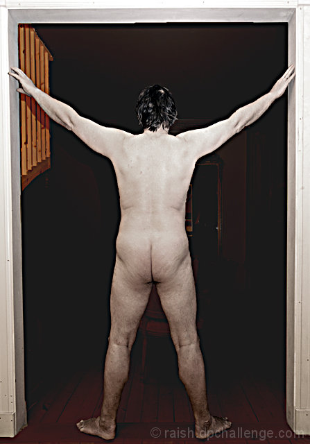
I think it would be neat if you tried this again with a neutral beige background, then pushed it to B&W and changed the colour to be a desaturated skintone... sepia like. I'm not entirely sure of the Leonardo Da Vinci Vitruvian Man, but I think the key was keeping the arms and the legs an equal distance apart.
There's nothing wrong with your body... it reflects the body of a man your age. This was a great attempt. Seriously, try it again!
Interesting idea. But the execution needs work. The doorframe detracts and you could use more light on the lower body, or less light on the upper body.
The lighting on this is very harsh and the pose uninteresting. I'm assuming (based on your title) that you are doing a parallel to Leonard Da Vinci's "Vitruvian Man". The only thing that leads the viewer to this conclusion is the title. The background totally removes any indication of what you are attempting. Perhaps if this was shot on a white background and done in a high key nature and then toned down in post-processing with some sepia tones, you could better achieve your vision.
This is a good idea. Would probably be more effective and a stronger presentation if you used like a black sheet or something for a solid plain background, and not have the doorframe and other elements.
I think one of the biggest problems with this picture is the lighting. The on camera flash creates a very flat and uninteresting image. A more directional side lighting could be used to add more mood to the picture. The background also doesn't add to the image.
the background looks pretty distracting, I think I'd rather see this in a studio-environment (black background). It also looks like you desaturated the body, not sure if I like that (ofcourse I don't know the original file :))






 Add photograph to your favorites
 Add photographer to your favorites

 Photographer found comment helpful.


