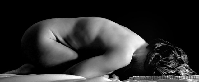
My first-ever nude. I hope to get some comments. I worked hard to get the background plain and the shadow and light interesting.
Lighting was two compact fluorescents in clamp lamps with reflectors a few fee to the right of the image, mounted on boxes to get them higher than the bed.
Editing was converting to B&W using channel mixer, contrast enhancement, and selective color to drive the shadows to black.
Then I did quite a bit of work with noise reduction, further spot blurring, and dodge/burn around the line between the neck and shoulders - it was quite a stark line in the original. I also dodged the foot a bit so it wasn't so dark.
Statistics
Place: 91 out of 121 Avg (all users): 5.0869 Avg (commenters): 5.1818 Avg (participants): 4.6506 Avg (non-participants): 5.1858 Views since voting: 5310 Views during voting: 897 Votes: 449 Comments: 15 Favorites: 1 (view)
From a technical perspective i think this one holds it's own in the challenge. the focus is soft, but in the nice way - it doesn't look blurry or 'off', just soft - which is nice. My guess is that you used a fairly small single light source, or it was fairly low and directed across her body. I guess this because the light is fairly harsh on her neck, and drops off fairly quickly as it works its way down her body.
A few ways around the blown highlights on her hair and neck:
-a more diffused or larger light source (either a bigger light, or use a big diffuser; sheer white fabric works as does bouncing the light off of white posterboard or reflector)
-you could raise the light higher and a bit closer to her so it's a bit more even (though this may lose some of the shadows which IMO add to the appeal of the image)
-leave the light where it is, but underexpose it a little (so the hotspots are gone), then use the dodge tool in PS to selectively bring the lower parts up a little to match more evenly.
Compositionally i think you have a great idea, but a few things make it a bit uncomfortable to look at. The almost panoramic crop doesn't work for me so much; it really closes the image in on top, and while I get that you were working within the 'confined' theme I think the pose conveys that message well enough by itself. I think simply adding some negative space at the top would free the image and in some ways enhance the feeling of confinement. I might add a little space at her head and feet for the same reason.
I don't think the blanket at the bottom adds to the image any, and it competes with the the smooth lines that her body creates.
Her pose seems to depict exactly what you were after and creates a really nice flow to that part of the image. the only thing I might try would be to have her relax her head/neck a little...it looks like she's forcing her face into the ground and seems a bit unnatural (might be more the blanket doing that...not sure). Understanding that she may be somewhat shy and really wanted her face hidden, I might suggest moving her arms up a little to hide her face; but really...the shadows will do most of the work anyway with the directional lighting.
All in all i think it's a very nice photo...it was among my higher votes (a 7) If you are so inclined, I'd love to see how it looks without the blanket and with a slightly looser and taller crop.
all of the preceding rambling was of course just my opinion - artistic freedom is entirely yours and feel free to disregard my thoughts at will :)






 Add photograph to your favorites
 Add photographer to your favorites

 Photographer found comment helpful.


