| Author | Thread |
Comments Made During the Challenge  |
|
|
11/16/2003 11:50:46 PM |
I commented on this one already but it never took! EEK!
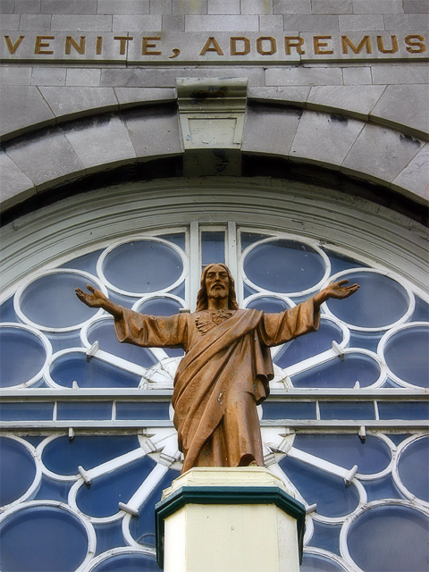
I like the idea and the shot but the crop could have been tighter on the top, leaving the lettering out. The lines look good taking you across the shot and the angle is also well done, looking down on you as he protects you. The contrast and brightness could be brought up just a touch to really make the shot pop. Started at a 5, going to a 6 |
|
 Photographer found comment helpful. Photographer found comment helpful. |
|
|
11/12/2003 03:31:05 PM |
|
good, literal depiction of the theme and a reasonable recording of what is there |
|
| Photographer found comment helpful. |
|
|
11/10/2003 09:29:01 PM |
|
nicely framed with the words behind. Not very subtle, but effective. |
|
| Photographer found comment helpful. |
|
|
11/10/2003 06:24:22 PM |
|
Very good photo. It is very clear, the color stands out and the composition is good. |
|
| Photographer found comment helpful. |
|
|
11/10/2003 04:53:55 PM |
|
Very good and I like it very much. |
|
Theme:
Classic /
Light /
Dark
Home -
Challenges -
Community -
League -
Photos -
Cameras -
Lenses -
Learn -
Help -
Terms of Use -
Privacy -
Top ^
DPChallenge, and website content and design, Copyright © 2001-2026 Challenging Technologies, LLC.
All digital photo copyrights belong to the photographers and may not be used without permission.
Current Server Time: 10/10/2026 08:23:26 PM EDT.






 Add photograph to your favorites
 Add photographer to your favorites


