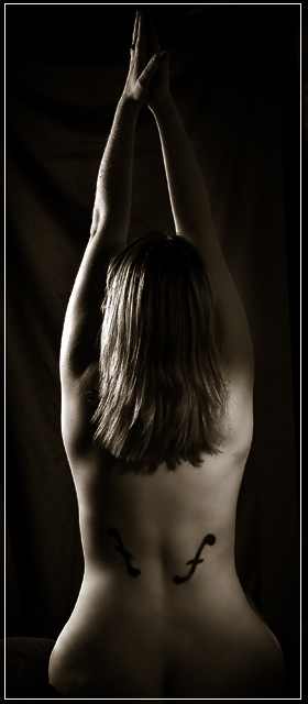
Wanted to try my first real nude but the original idea with the original model didn't happen.
Then had this idea (from Man Ray) so asked the wife to pose but she is the worst model ever in that she is very impatient and on the last night before the close she reneged. So just went for a quiet Sunday dinner prepared to give it a miss. At the restaurant one of my closest friends rang and asked if he and his daughter could join us for dinner.
During the meal I mentioned the challenge and Rebecca volunteered so I jumped at the chance and we came back and did this shoot. This is the best out of 54 shots.
Thanks Beck for posing, hope it doesn't crash & burn.
PP: Levels, curves, Hue/Sat, cloned out skin blemishes & cleaned up skin drawing, vignette, dodge & burn, smart sharpen,neat image, border, duotone, save for web
Lighting: One SB600 into a brolly on model left and another with a snoot behind model to camera right.
Title: Neil Diamond
Statistics
Place: 55 out of 121 Avg (all users): 5.7783 Avg (commenters): 6.0357 Avg (participants): 5.6375 Avg (non-participants): 5.8086 Views since voting: 6047 Views during voting: 1001 Votes: 451 Comments: 30 Favorites: 2 (view)
I like the idea of this shot, but I think the lighting on the arms is just a bit distracting from the subject itself. My eye wants to draw to the light line down the left hand side rather than focus on the subject as a whole.
Good idea, but a symmetrical image like this this suffers from the model being a little tilted. I would have rotated the image just enough to straighten her out. Lighting is good, but the left clef happens to be in a shadow and on my old monitor it almost blends in.
You are the sun
I am the moon
you are the words
...
Neil Diamond rocks!
Anyway ---
This is a superb study in showing how instrument design mimics the female form. I love the lighting but would like to see the other f-hole lit more.
lighting is good. crop is much too tight, aspect ratio is much too narrow. Just my opinion: I would never try copy an outstanding and well known idea as this from the Man Ray shot, the attempt is condemned to fail.
Very nice light in my opinion, though you needed just a touch more to get the clef (I think it is) on the one side a bit more visible. Very creative approach, too.
Nice concept, would have preferred this if the background was a true black and both of the f-holes stood out better. Also a bit more negative space on either side would have accentuated the strength of the central composition.
I've seen this done before. I think there's another "sound hole" on her left back, but unfortunately it's not clear. Most voters (those who are not familiar with the structure of the string instruments)won't "get it" because the second one is not visible. You needed to have enough light right across the back to just pick up both halves.
Having said all that, I really like it personally.






 Add photograph to your favorites
 Add photographer to your favorites


 Photographer found comment helpful.


