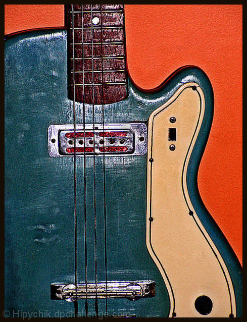
Crop, adjust color, saturation, sharpen, sharpen & sharpen, burn, resize. I know this has alot of sharpen, but I liked the way it looked on this photo. This is a 1960's guitar that I found in my attic when I bought my house. I love the color and all the texture in it. It's leaning on the orange wall in my family room.
Statistics
Place: 382 out of 559 Avg (all users): 5.2685 Avg (commenters): 6.8000 Avg (participants): 5.2712 Avg (non-participants): 5.2581 Views since voting: 843 Views during voting: 192 Votes: 149 Comments: 8 Favorites: 0
The technicals: lighting is good. colors are nicely contrasted. Yes, it's sharp. You get away with it on the guitar on my monitor, but I run 1900x1200 and I bet on a lower res it is too sharp. The sharpness, however, does not work with the texture of your wall. It comes across as noise. I would have applied a gaussian blur to the background (or just masked off the sharpening). Is the guitar slanting just slightly to the left?
The feel: A nice feel and a simple shot. I mostly like the contrast of the blues and orange and the curve of the body.
The game: A subtle shot. If you enter subtle, don't worry about the score not being in the stratosphere. It rarely happens on DPC.
You've made this into graphic art, I like it a lot. The colours and the processing are great and the textures jump out at you. I would frame it and put it on my wall.
Good composition and use of colour. It's let down by the lighting though. Judging from the glare at the centre of the shot you used on-camera flash for this. Try experimenting with natural light from a window (you might need longer shutter speeds).
Also, it looks like there's slightly too much sharpening, there's a halo effect appearing on the neck and around the strings.






 Add photograph to your favorites
 Add photographer to your favorites

 Photographer found comment helpful.


