Author Thread Comments Made During the Challenge
Post actions
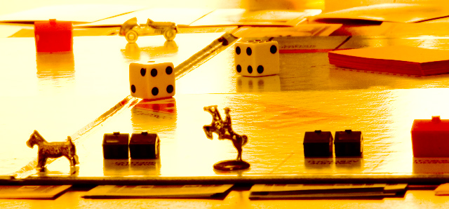
love the lighting in this shot!
Post actions
It's really a dreadful game, but I like the lighting and set up of your photo.
Post actions
Too much glare with the backlight on a glossy surface.A lot of the foreground details got lost. It might have been better sidelit.
Post actions
Post actions
IMHO some whitebalance adjustment would help.
Post actions
Oh man, great idea for this.. Only major problem is the lighting is so harsh you can barely tell this is a Monopoly board. I think this with better lighting and in B & W would have been at a minimum an 8 for me.
Post actions
I'm not fond of the lighting here.
Post actions
very cool, it looks like the sun is filling up the whole land of monopoly... i like it alot
Post actions
looks a little yellow to me..maybe the lighting or maybe the color on my computer?
Post actions
Image is devastated by blowouts and yellow casting. Perhaps overhead lighting is fluorescent, but looks more like direct sunlight at early morning.
Post actions
IMHO white balance is poor and also the exposure, highlights blown out, darks to dark.




 Add photograph to your favorites
 Add photographer to your favorites


