|
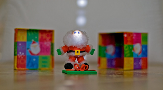
meets challenge, but needs lighting and compositional work. santa is too much in the center. not sure what the light highlights are moving down the middle of the frame, but they are distracting and don't add anything to the image. the surface that the santa is sitting on isn't very attractive and the color is distracting from your main elements; would have been better to drape the white background across the surface. sorry - 4. |





 Add photograph to your favorites
 Add photographer to your favorites


 Photographer found comment helpful.

