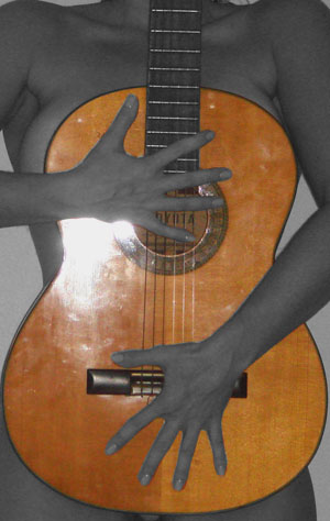
the glare is very distracting and you have some masking problems on you selective desat. sometimes it can be easier to selectively desat using the hue saturation option.
Composition and pose don't work for me. Also the blown out highlight on the guitar is very distracting, and the selective coloring (de-coloring?) doesn't improve the shot either.
The flash is very overpowering and the grain and lack of contrast also take away from the image as a whole. The crop is too tight and the selective desaturation does nothing for me. I'm sorry if this seems overly harsh, but it is my honest opinion. I would recommend not using an on camera flash for shots of this nature and experiment more with proper lighting techniques. The duality of the title is very nice but I'm not a fan of the image itself.
the harsh lighting on the guitar probably isn't working for the voters. you can avoid that by placing your flash a bit to the side, or, even better, don't use a flash at all.
skintones are a bit too gray for me, and the selective desat is a bit messy ;)
This is a really great idea. A composition that could really work well. I think there are a few things holding the image back though. Probably the biggest thing is the lighting. See how the woman is very flat, and the guitar face has that large obtrusive glare spot? This is something that you just have to take the time to experiment, move around, find good even lighting with no glare or harsh shadows. Especially with a very reflective surface, like the guitar. Also, some attention to detail, like cleaning the guitar before the shoot (you can see the smudges and fingerprints all over it), and ensuring the guitar is held straight (see how it is tilted to the right?) I also see that your image is only 474 px. It really is in your best interest to use as much of the full 640 allowed. There is a good tutorial on the site (under Learn on the menu bar) about sizing and preparing challenge entries. I think that with some work on lighting and little details, this great concept could be a very strong photo.
I LOVE the composition. It's very nice, but it's execution, I'd like to see cleaned up. #1, I don't like the desat, B&W or color here would be fine, but the desat isn't right. if you REALLY want to do the desat, desat the guitar, and not the girl. And then do something about the flash on the guitar, light it from the side or something to make that reflection go away. Great start though, and PLEASE reshoot, cause I'd love to see it without the flash at least.
This could be great if only you hadn't used the on camera flash. The reflection & fingerprints all over the guitar subtract so much from a really great image.
I like this idea. Lighting is a tad harsh with the glare on the guitar. Not sure if you desaturated the body but I think it would look a bit richer and warmer in color.
Why is the model in BW but the guiter in color? I know that selective colors do wotk, but they do it not here. And it got this bad flass glare on the guiter. Better luck next time
Would have been so much better without the glare of the flash. Love the contrast of color and skin. bottom hand placement perfect, upper hand not so sure.







 Add photograph to your favorites
 Add photographer to your favorites


 Photographer found comment helpful.


