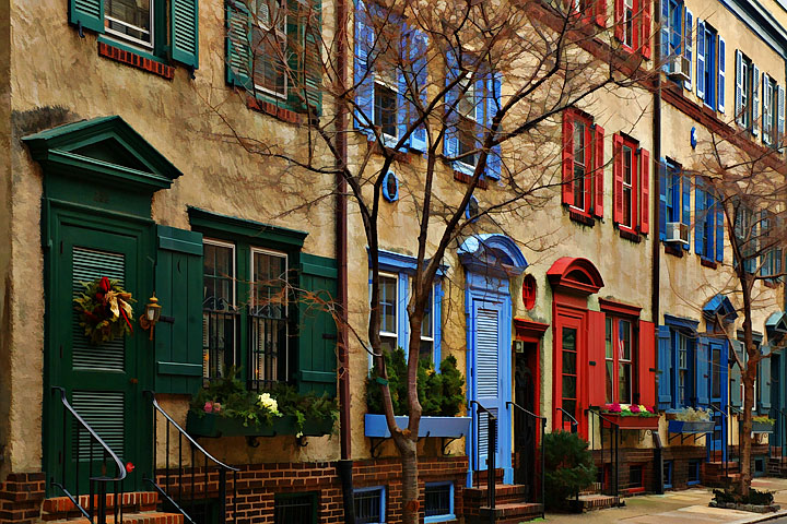
I first photographed the 200 block of Van Pelt Street some time around the Spring of 2003. I went back in January of 2004 and took some more and one shot done as DA did OK. Well I went back this past Sunday and shot again, this time in landscpape orientation in order to fill the frame as much as I could with the 5 houses in the image. I actually like how this turned out a bit better than the first. I basically did the same processing as the first with some additions and changes to some of it. It's my favorite block in Philly and I've yet to find something that rivals this wonderful RGB color scheme.
Post: Convert from raw in PSElements 3.0 with a +0.33 exposure compensation. Select entire canvas and corrected for camera distortion to straighten the buildings. Two small crops right in and top down to maintain the aspect ratio. Layer adjustments for levels, brightness/contrast and hue/saturation. Merge. Layer of curves adjustment. Merge. Layer of Flaming Pear Kyoto Color for addition saturation.Merge (all merges in normal mode).Layer of Hi Pass at 55.5 pixels and then USM at 70%, 55 pixels, 0 thresh hold. Merge Soft Light mode at 66% opacity. Saved image. Applied Buzz Simplifier No. 1 set at 100 (tried 40 did not like the effect as much). Sharpen. There was a very small area of bright white sky at the very tip of the upper right corner that just bugged me. I selected the area and did replace color just darkening the white to a light gray. Save. Resize. Sharpen. I took another look at it and I wanted something just a wee more painterly. I had saved the image pre buzz so I re buzzed at 200 and sharpened. Then I cloned a block of color near the upper right corner. The Buzzed again at 200. Did not sharpen again. Resized and then sharpened.
Statistics
Place: 23 out of 211 Avg (all users): 6.3503 Avg (commenters): 7.0000 Avg (participants): 6.1625 Avg (non-participants): 6.5455 Views since voting: 1362 Views during voting: 233 Votes: 157 Comments: 19 Favorites: 2 (view)
Nice shot, I am debating between cropping a bit on the left to give an impression of 'infinity', or leave it as it is for the oposite reason. Dunno the answer. Nice shot regardless. 7 . Lionel
I don't feel that this meets the challenge of getting in close with the subject. Too much distance, though it's an interesting picture for another challenge.
This is very sweet in so many ways. The light is excellent, the colors are striking, the composition in general is crisp and clean. I wish you had more foreground lower left, to see more of the stoop (those stairs would be symbolically important to me), and I wish you'd used some shadow recovery on the dark entry on the left. But all-in-all, a strong image :-)






 Add photograph to your favorites
 Add photographer to your favorites

 Photographer found comment helpful.


