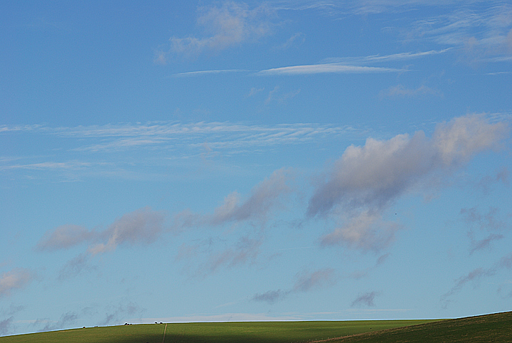
Nice choice of subject with just the right amount of non-landscape terrestrial elements. I wish the horizon where closer to 1/3 of the lower part of the frame though.
Reminds me of the Windows logo a little bit (not meant as an insult). I like the way you've treated the ground as a small portion of the landscape. Very successful.
Um, I like what you were going for here. This type of shot is usually my favourite: just a narrow band of land, and an awesome sky. But unfortunately here, you didn't really include a subject. The farm houses are just too small to make out, and so it doesn't leave much for the viewer to look at.
Be really nice if you hadn't gone overboard with sharpening and haloed the entire horizon. That really hurts it for me. Otherwise super-sweet, lovely pastels.






 Add photograph to your favorites
 Add photographer to your favorites


 Photographer found comment helpful.


