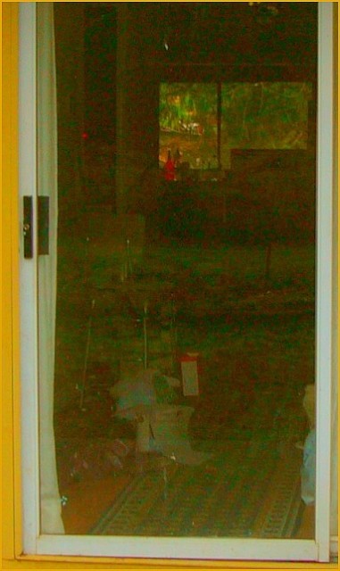
Should have saved this for the "Bad" contest. Thanks for the great gamut of comments on this last minute underexposed, unpolarized, unarranged and totally oversaturated image. It was born a dud, but I tried to milk it - fascinating what information there is in these bad shots - and then, ignominy, posthumous beat me with supernumeral mathematics out of total extinction.
Rook Master strikes again.....Here's a challenge: spend as much time trying to create a more "pleasing" image as you do rooting out these brown winners - get a top 10 and I'll mail you a $20 bill - Honestly. any other takers?
The idea of this photo isn't bad. I like the yellow trim and border you added. Maybe a bit more of that. A stronger contrast between white and yellow. I think the relection in the glass is a big deterrant, especially if you were going for the "lines" the carpet inside. A polarizer might have helped here or a screen to shield the reflection. Like I said, I like the idea of the carpet in the house, maybe if you remove some of the other clutter and helped reinforce the line inside that would help. You could almost have a color study on this one, just need to emphasize the colors a bit more (add another yellow element inside the door)...







 Add photograph to your favorites
 Add photographer to your favorites

 Photographer found comment helpful.


