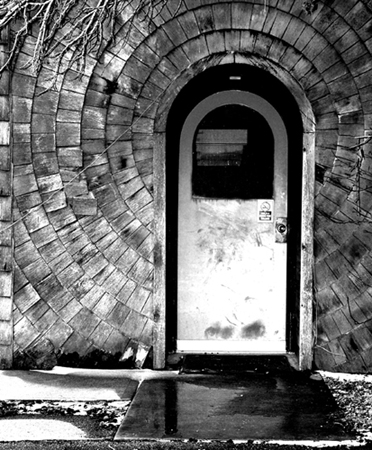
This is a fun entrance, and you titled this well also. Wish we could see more of this - always use the 640 max length to show detail. Based on the size of this, it appears a little soft in the details. All JMO of course. Good luck in the challenge.
Great subject with the radial pattern. I would have cropped at the bottom to remove the distracting foreground. No color works well for this too, as the pattern is physical, and not a color pattern.
It's a great shot that i feel could have been made even better with just a couple of things.
1. Just a tad of rotation could have straightened the door
2. A crop just above that first horizontal line from the bottom with what looks like snow on the right hand side of it would just keep that highlight out of the frame and keep us at the important door and pattern.
3.Just a little more control on the exposure just so the highlights did not burn out so much.
Sorry if this seems a bit much but I love this image and think you could have had a stronger entry here with the things suggested. Please note this is only my opinion and I did take a long time with a piece of card cropping off that bottom line and I think if you try it you might agree.
Most important though is YOU like the image. Well done.






 Add photograph to your favorites
 Add photographer to your favorites

 Photographer found comment helpful.


