I had plenty of pics to choose from.
Went with the posted version since I think it was more true to minimalism as I understood it and to the topic description. I'm pretty happy with the photo but would've liked the dark to bright light fall off gradient near the bottom right to have had a smoother transition. Dont think it has anything to do with shooting in JPG but perhaps the resizing method?
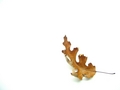
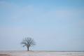
Here are some of the outtakes:
Statistics
Place: 9 out of 231 Avg (all users): 6.4551 Avg (commenters): 8.0000 Avg (participants): 6.3846 Avg (non-participants): 6.5169 Views since voting: 2685 Views during voting: 271 Votes: 167 Comments: 11 Favorites: 2 (view)
Outstanding from both a technical standpoint -- excellent composition, exposure and b&w treatment (especially considering the ME rules this challenge) -- and from a subject standpoint. My only *10* thus far.
Great close up. The line leading up to the pen really draws the eye and creates a nice rhythm. The DOF is superb - really highlights the subject, but doesn't throw away the rest of the image. One of the best of this challenge, well done.






 Add photograph to your favorites
 Add photographer to your favorites


 Photographer found comment helpful.


