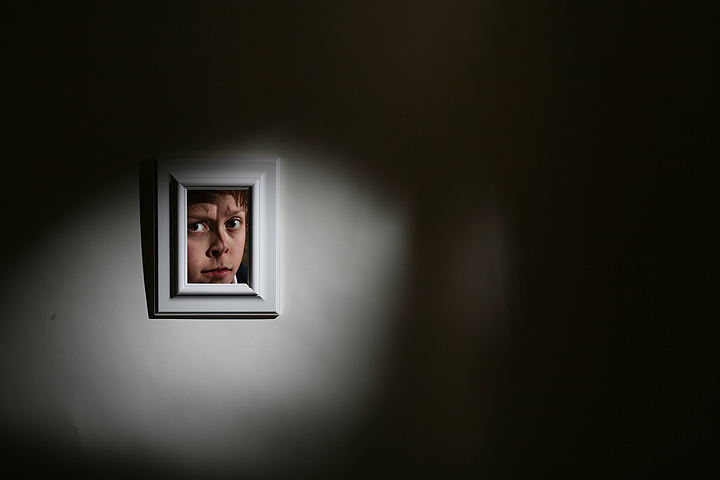
This didn't work for me on the whole; I wasn't sure about the minimalist intent with the use of a non-minimalist image as its focus, or what was being said; good use of lighting on the frame and the wall, though some of the shadows (to the left of the frame) are maybe a bit harsh.
Lighting is very good, subject is in sharp focus, and it is a simple & clean minimalistic shot. While lighting is good I think it can be even better because of where the spotlight and the amount falls. I think that if the spotlight was more rounded and was more tightly encircled the white frame you would have the indroduction of secondary elements of interest - shapes. A circular spotlight and the square frame surrounded by a backdrop of darkness. A more circular spotlight that totally encircles (the top left hand corner of the frame disappears into the darkness) the main subject would make it stand out and pop visually even more. Now, the boy in the frame is perfectly illuminated but there seems to be something odd with his face. His face looks seperated into two halves almost like a Picasso. That is either due to a lock of hair had fallen across his face or because of a shadow falling at an odd angle. Hmmm, in an odd way the oddness of the face in the frame does arrest and hold the viewer's attention. So on the visual interest score you score high on this facet:-)







 Add photograph to your favorites
 Add photographer to your favorites

 Photographer found comment helpful.


