cute. I think this is the pencil to a palm pilot. correct me if i'm wrong. i've never really seen one up close. angle and lighting are great. frame placement is ok. I wish the black pointer thing was a little farther away so maybe it was a little clearer. I can't really make it out, and never seeing one before, even harder for me to understand really what i"m looking at. however, focus and other technical aspects are fine. good luck with the challenge.
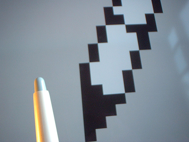
Photoshop and a graphic tablet's pencil. Clever, fitting for this site. What is the reflection on the computer screen? If is is intentional, I am missing the point.
I don't understand the intention of this photo. What is the computerized image and what does it represent? Is that the eraser of a mechanical pencil? The play of light on the pencil (?) is nice, but overall, I think this is a poor photo. Perhaps if you'd just worked with the pencil and the framing, but the computer icon only adds confusion for me, and leaves the pencil seemingly unimportant in the photo. I'm sorry, but I scored this a 1.
if i didn't know this was the pencil challenge i would've thought you had a pen there, this is not recognizable specifically as a pencil. there are some highlights on the pen. interesting with the 'pencil' design in the back (it's a little pixelated ;), but, to be honest, the shot just isn't very interesting to me and i think (personal interpretation) you barely meet the challenge. sorry. -- gr8photos (2)
Is that a pencil in the foreground? I honestly don't recognize it as such. I like the yellow and white lights on either side of your object. I also don't get the significance of the artwork in the background, but am assuming it has something to do with the concept you were attempting. (maybe pencil in pixelation?) The reflected light on the right side is also a bit distracting. 6 Swash
Meets Challenge Theme:I'm sure this must be some kind of pencil that I've never seen...so Yes even though it isn't recognizable to me. Technical :nice lighting on the pencil, but the image could be more clearly focused I think. Composition:good, interesting design Creativity/artistic:fair Remarks:On a personal level I don't find it very appealing...too cool for my taste, but like I said, that's personal. Grayce...aka...Gracious






 Add photograph to your favorites
 Add photographer to your favorites


