Challenge:Pencil (Classic Editing) Camera:Sony DSC-F505 Location: Ambridge PA US Date: Aug 13, 2002 Aperture: Auto Shutter: 1/8 Date Uploaded: Aug 16, 2002
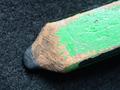
(1) COMPOSITION -CONTENT - The composition of this is very good and compelling to the viewer; it is probably the strongest aspect of the picture. First, the red contrasts with the blues, and that is almost always a pleasing color combination. Secondly, the red pencil lead draws attention, then the pencil helps to pull the eyes back and up, giving a sense of movement to the picture. A couple of ideas -- did you try having the blue pencils lying in a "pattern" so that it looked more consistent, rather than just random. This may have helped pull the eyes even more. Also, if the leads were "touching" (obviously they couldn't because of the glass), it may have given an even stronger "illusion" feeling. Finally, I think a tighter crop would help eliminate soem of the bright foreground. Maybe even let the pencils overflow out of the frame some.
(2) BACKGROUND - The "background" of this picture is actually "the underground!" Having the red pencil "floating" is a very nice effect. Also, the blue pencils being blurry actually causes the eyes to focus on the red pencil, so in this instance, it adds to the overall effect of the pencil.
(3) CAMERA WORK -TECHNICAL - I am glad to read this process, and I am going to try it in the future! I am assuming you were using a shutter priority mode since the aperture says auto. If this is the case, you may have had as much depth of field as possible. I think if more of the red pencil could have been in focus, it would have been more effective. Maybe backing away and using the zoom, instead of a macro type setting. Also, the front of the pencil is a overexposed, as is the front of the frame, detracting some from the overall effect. Using a softer light, (shining through a light cloth, but be careful, don't sit it on fire) or bouncing it off of a white wall (or cover a piece of cardboard with aluminum foil to use as a reflector) will sometiems help to take the edge off. Since you were using an 8 second exposure, less light may have worked okay.
(4) DIGITAL PROCESSING - TECHNICAL - The color is very good in this, and having had two sonys, you receive an extra thumbs up for keeping the red "normal," since Sony reds seem to be whacky sometimes. It is not oversharpened, and the white balance is good.
(5) YOUR OPINION ON THE PHOTO - Overall, I really like this picture. The first time I judged it, I only gave it a four. However, at second and closer glances, I probably should have given it a 6. The exposure and focus issues mentioned earlier prevent me from scoring it higher than that. Overall, it is a very neat effect, adn one I look forward to trying.
First, the red pencil was laid on a 10mm sheet of tempered glass above the blue pencils. The glass had a slight blue hue to it, giving the image the blueish gradient.
Second, to give the blue pencils a faded effect, I varied the exposure across the length of the pencils by creating a "shutter" with a sheet of paper. After releasing the camera shutter, I would quickly remove the sheet of paper... quite tricky when dealing with a max. shutter speed of 1/8!
I understand how this was done, but I have to wonder if you did the washed out background on purpose. I was thinking that it may have been done on purpose to emphasize how the red one stands out so much from the others making it the "black sheep". You have a different twist on it by sharpening it with a knife rather than a pencil sharpener, puts some originality in the photo. great job and good luck in the challenge.
I just LOVE this. There is such a strange milky quality to the pencils in blue, and the photo is just incredible. Spot editting (I know not allowed on DPC) would allow you to remove the tiny spot near the red pencil lead (you have probably done that already on a different version, I'd bet!). I would really like to see a HOW DID THEY DO THAT? tutorial on this photograph. Joint favourite this week. 10, Kavey
I hope you explain how you did this in your comments or notes. I notice your's is the only pic i've seen where the pencils were sharpened by knife rather than by sharpener. It adds some nice texture and lighting surfaces.
Really nice work - the pencil is jumping out at me! I like the whole thing - the colors and the way the blue is on the side and sort of blends with the other pencils and how stark the light is on the tip of the red pencil - this photo is screaming - look at me! look at me! Very artistic - reflects a lot of time and effort (was a 9) 10! Ruthann
Cool effect on this. I don't really like the DOF though. I wish it was either smaller so the top of the pencil was more blurred or bigger so the whole pencil was in focus. Anyway, it's still one of the better shots this week.
This is way cool... would love to know how you did it. Picture seems a little blotty up top, but that may be a DOF thing. It is also a bit too bright for my taste. --6-- sohr
I like this image and wonder how you did it. The increasing blur on the other pencils works very well. It creates a nice mystique. 7 for now definitely will revisit lateron this week. Journey. Update: This image is one that keeps pulling my attention again and again. As a humdrum aside, I get the feeling that the photographer is someone who likes to work with pencils since they are sharpened with a knife :) Anyway, congrat and a 10 Journey
I think this had the makings of a great shot but just missed the mark a little. Focus a little too soft...I'm not even sure but I just felt myself wanting something else.






 Add photograph to your favorites
 Add photographer to your favorites


