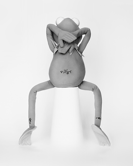
Almost a year has gone by since I first used Kermit - and it was a deja vu of a nude entry. I knew this challenge was coming sometime soon and I knew that I was going to do something with Kermit (a SP would be bad - very very bad). My initial idea was having Kermit in the shower but the size perspective was bad. So I looked through the top 10s of the previous nude challenges with Kermit in hand, twisting and bending his body to see which image he could actually form to. Sonifo's "Body Art" from nude challenge number 3 turned out to be the best and easiest to shoot.
Set on white poster board and a tall cup covered in printer paper. The only lighting was from our front window. The tattoos are made on clear tape with sharpie drawings. I clipped the tape after it dried. I could have done larger tattoos but I wanted the image to be subtle and not too over the top.
I figure this wont score gangbusters but I am guessing comments galore. I really like this image from a humor and technical POV. I think this is a good match with my quasi entry. I see that Sonifo doesnt really play here anymore so I wont hold my breath for a comment. Enjoy!!!
Post Challenge - After reading Pedros assessment of my image I realized that me entering this could have been taken as an insult to those who submitted pics of themselves or boy/girlfriends/wives/husbands. I did not mean that at all. I entered this because I felt it somewhat fit and had good humor init. To anyone who took offense to this image I apologize. And to all of those who got a good giggle from this I say thank you.
Statistics
Place: 96 out of 121 Avg (all users): 4.9551 Avg (commenters): 6.0588 Avg (participants): 4.5000 Avg (non-participants): 5.0548 Views since voting: 3434 Views during voting: 1443 Votes: 445 Comments: 63 Favorites: 4 (view)
love this! After looking at all of the nudes....this really made me smile. Love your sense of humor and my hat is off to ya for entering this way! Love your creativity.
well, I like it:) bumping you but you should be ashamed of defacing a perfectly good kermit like that. and BTW if this is Tim I thought you retired him:)
OMG!!! I looked at the thumbnail, and thought it was kermit the frog, and I'm right! Very clever. Not sure how a nude muppet will do in the challenge, but it made me laugh.
it's not that easy...being greeeeenn (one of my little guy's favourite songs :))
ok - so from a topical standpoint, you'll get punished for a few reasons: first off, toys, stuffed animals, woodies, etc all tend to get hammered by virtue of their very being. hard to differentiate those from a poor opinion of the photo. Secondly (specific to this challenge) a lot of people went WAY out of their comfort zone to enter themselves or a loved one naked, and will take this as an insult to their serious effort. that should affect their score, but it will. Lastly, a 'tribute' in all senses of the word, should seek to improve upon or show respect to the original, and with an original as good as Soni's - you've got some stiff competition.
Technically speaking it has strength. The setup/composition is good so it has a nice flow. Technically speaking I notice a few little things that could be improved upon (i'm nowhere near perfect, but I have been working hard on improving my studio stuff in the last few months, so these are the things I'd criticize my own work for).
The first thing I notice is that it's a bit overexposed...the whites are a bit blown out near the bottom of the image. when I'm shooting on a white backdrop I tend to light slightly from above, and I try to get more light on the back than the ground (particularly when it's white on white like this one). it gives a sense of surrounding and provides a base for the image; kermit almost looks like he's levitating. Ideally you will have a little contrast on the ground, even if it's just a wee shadow around the base of the object and below the feet. A simple little cheat on a BW image is to use a *slightly* off white pedistal in this case - 5% grey maybe, which will look like shadow.
Second thing i see is either a slight blur that has been sharpened to compensate, or compression artifacts that show up as blur. I'm guessing it may be a bit of both, because i can see some haloing around the edges that usually comes from sharpening. I don't mind softer focus, but it needs to be consistent - in your image some of it is tack sharp, while other parts seem soft (his right leg, for example seems artificially sharp with compression artifacts around it). The solution to all of this of course is simple - add more light, close up the aperture a little for greater DOF (F8-F9 is perfect for an indoor studio), pay close attention to focus, and (if you didn't) use a tripod.
i like the attention to detail - the tattoos, hand positions, etc...shows you paid attention, which shows respect for the original. If you were looking to improve on the composition (no insult to Soni) I'd have cropped it to give more space above him, and less below to open the image up a little. I like to give models room to move through a photo - even borders all the way around give a sense of confinement to me - but that's a personal preference thing.
So there you have it...my thoughts all wrapped into one. Overall it's a well done image, with a few minor details that could have been improved. In a tribute challenge, I'd expect this to score a 6.5ish overall. as it stands, I won't be surprised to see it in the high 4s or low 5s.
Five points for meeting the challenge (more or less - I mean, Kermie's most probably nude, but I'm certainly not gonna check or ask). Add a point for being nicely exposed and presented. The picture, not the frog. Add another point for the creativity and cajones to enter this. It's actually quite cute!
Jim Henson could be spinning in his grave at this depiction of Kermit, but I suppose he couldn't really complain at the innuendo presented here as he had his hand up the frog for so many years.






 Add photograph to your favorites
 Add photographer to your favorites

 Photographer found comment helpful.


