Hi! I had commented on this shot during the challenge, now let me see if I can be a little more specific! :)
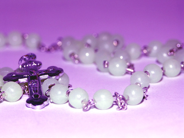
Like I said before, I love the shot overall, the composition is well done, the cross off the the left and the beads leading your around the shot.
The DOF is well done but a tad more clarity/sharpness on the cross the the front beads I think would really make this shot jump out at me. The color still bothers me a bit too. The purplish/pink hue just doesn't seem to quite fit the scene to me. I would love to see this shot in black and white or with a sepia tones. Or possibly bring up the contrast just a touch to really make the shot pop out at me.
I also like the angle of the shot but if you do reshoot this, maybe come up just a 1/4 of an inch so you could really get the feel of the flow of the beads through the shot. The beads in the front are just a bit blown out, not sure what lighting you used, maybe a light coming in from each side to defuse the light from the front. Also the beads seems to have a halo around them, this is a great effect for this challenge and I would love to know how it was achieved.
Hope this helps!
Good Luck In Future Challenges!
Deannda
DNeufer@stny.rr.com if you have any questions or want to discuss this further!
This is a beautiful shot, the way the rosary weaves through the picture is very nice and the DOF is also very well done, the clarity in the front to the blur in the back. The only thing that bugs me is the coloring. The purplish/pink hue hurts this shot to me, I'm thinking more gold or yellow tones for some reason. An 8
Nice shot. I would like to see the cross with more space on the left of it, and maybe a duotone to the overal image. I'm not sure the purple is helping you here.
The shallow depth of field works well in this shot...it gives a sense of depth to the beads as they trail into the background. I like the violet color of the image, but it's a bit too brint in places for my liking. Overall, I feel this is a decent shot, nice work.





 Add photograph to your favorites
 Add photographer to your favorites


