Good use of composition and getting in close to not have background elements distracting. A soft warm-colored side light would really make this pop and give it "mood".
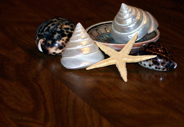
I like the selection of objects and the way you've arranged them. The lighting is good too. But I don't care for the composition; the negative space detracts from the feeling of the image. It also needs to be a little sharper.
Whilte you made some attempt at composition, I do not feel that what you came up with is the best you might have done. The background is a bit dark but that's OK as it provides some contrast to your subjects and the grain of the wood makes it less static thana plain BG. Feel it could have been lit better , maybe lose the plate as it seems like 'which one does not belong, class' and repositioned the remaing subjects for better comp. 5





 Add photograph to your favorites
 Add photographer to your favorites


 Photographer found comment helpful.


