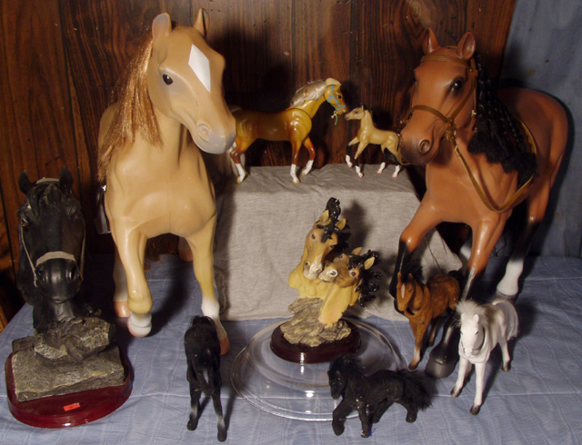
overkill, the background at the bottom and on the pedestal are really not good, though of the two, the natural color on the pedestal works better against the paneling in the back. Might have considered losing the blue, and all the horses except the two on the natural colored pedestal and used that as you shot.
Nice idea and choice of background. The browns of the horses go well with the browns of the paneling. The cloths on the table detract from this simple color scheme. You also have too much going on here. If you took a couple of horses (maybe the same size or color) and got closer with MORE LIGHT, you would get much more detail and a better over all effect!
TC
When you decided that this subject would be your choice for the “Still Life” challenge, how many different photos did you make to try to find the best perspective? How many different lighting options did you try to see how light changes could change the mood of the photo? I believe that some considerations of these elements could have helped you create a higher impact photo.




 Add photograph to your favorites
 Add photographer to your favorites


 Photographer found comment helpful.


