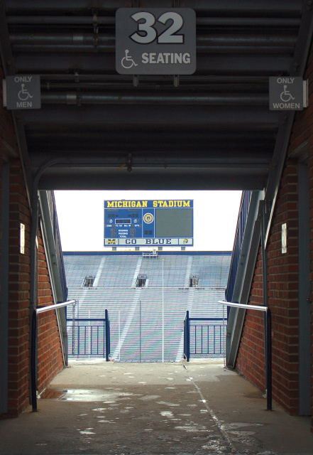
Heh - looks like this one was worth it for the comments - Michigan fans are rabid, are they not? Definitely meets the challenge and you did a good job balancing the light to get detail both inside and out.
Haha, well the Blue fans found you! This is cool. Might maybe crop below the bathroom signs and then pump up the saturation to show off the brick and the blue in the distance. Interesting that there is a kind of moire pattern there on the stands. I like the centering and the good deep focus so that I can read the words on the scoreboard. The handrails do well to lead my eyes out there as well.
Bob, nice framing of the signboard, good clear pic, great DOF.....I'm a little confused by what appears to be a concentration on disabled access, it's just a tad busy for me.....intentional or happenstance?
Go BUCKEYE'S !!!! lol.. Sorry, as a true Ohio St. fan, I have to score you a one for the subject matter alone.. (Just kidding), I think this is a solid 6. Great Job.





 Add photograph to your favorites
 Add photographer to your favorites

 Photographer found comment helpful.


