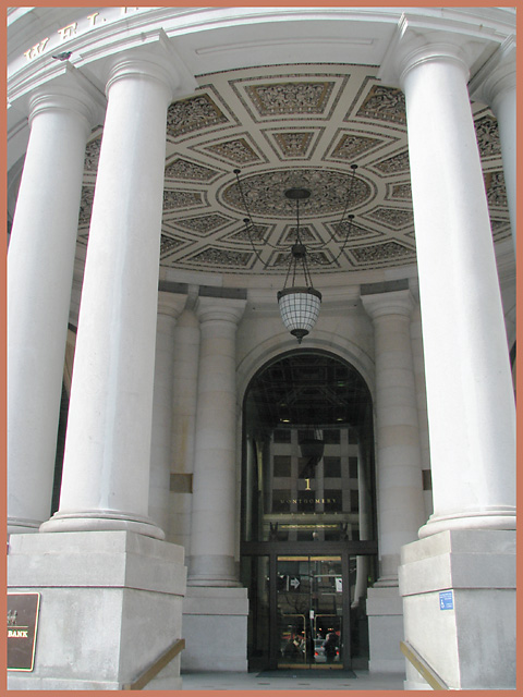
Challenge:Entrance (Basic Editing) Collection:Portfolio Camera:Canon PowerShot S3 IS Location: San Francisco, California, USA Date: Jan 19, 2007 Aperture: 4.0 ISO: 80 Shutter: 1/60 Date Uploaded: Jan 20, 2007
This clearly fits the challenge, but it doesn't do much for me. The reflections in the glass (the actual entrance) are extremely distracting for me, as is the focus (which seems off when it comes to the doors. I generally do not like the lighting, which is a bit drab toward inside the pillars. Taking this shot at a different time of the day might have helped, though I'm not sure how to overcome the reflections in the glass.
I think a shot like this begs for symmetry, and this shot obviously lacks it. I also think that the light isn't good. I guess a shot early in the morning or late in the evening, when the light is diffused and with a warm cast, might improve the lightning, that is, the darkness of the gate and the whiteness of the pillars wouldn't be so "angry" at each other.
Seeing the reflection on the glass of the door, I think you could have made a good photo just by taking a shot of the gate, neglecting the pillars. What I'm trying to say is that there are so many elements here competing for attention: the gate, which is supposed to be the main subject of the photo, I guess, the pillars, the ceiling with the hanging lamp or whatever you call that thing. So, compositionally, I tend to think that this photo wasn't thought out at all.
I'm not a fan of the border color and it's off center. If you could have centered the door and the columns around it, I think this would score higher. Fantastic site though.







 Add photograph to your favorites
 Add photographer to your favorites


 Photographer found comment helpful.


