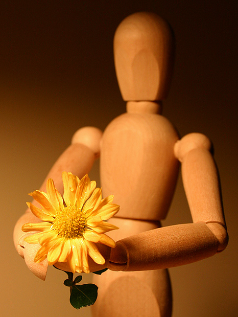
A whimsical photo, creative and simple. Technically perfect except for some barely noticable signs of oversharpening. I like most of the creative choices you made, especially the colors, background, and DOF. I think it needs more space at the bottom and left; the flower seems a bit too close to the frame. And the shadows are a bit harsh; a fill light on the right side would have helped soften them. But these are minor points; overall a very nice photo.
I love this shot. It is sweet and simple. The smooth lines of the wood behind the varied textures of the flower are nice contrasts and I like the soft focus on the figurine behind the sharper image of the flower. The colors are very pleasing and the composition is excellent. I wouldn't change a thing...except the score I originally gave you. I'm upping it to a 10.
What a creative image. I absolutely love the colors. I especially like how the background goes from dark to light. You picked the perfect flower to go in this image. Love the touch of water on it as well, it adds a little something =) Good stuff! (10)
Really enjoyting the DOF here, used very well and apporopriately. One thing I personally like about this shot is the color of the background, sure that sounds silly, but the way you exucuted it really brings out your subject. This is a very nice shot and I hope you do well. Good luck!
I have to be honest, I hate the wooden man, I can't explain why, I just do. I know he's a great tool for learning and makes some really nice shots but he's just so impersonal. Anyway, about this shot, the idea is nice, the focus on the flower is very good, I just noticed the water droplets. The cropping is well done and the DOF is also very well done and the lighting is close to perfect. I started this at 4 because it was wooden man honestly, which I explained in the beginning but coming back and looking again it's worth an 8
did everyone go out and buy one of these? i like the way the bg and subject colors go together so well. very nice exposure and good focus on the flower.
should have seen ths coming a mile away. They're going to ding you for lack of originality. I like the light gradation from the bottom left to the upper right. Use of DOF is pretty good too.







 Add photograph to your favorites
 Add photographer to your favorites

 Photographer found comment helpful.


