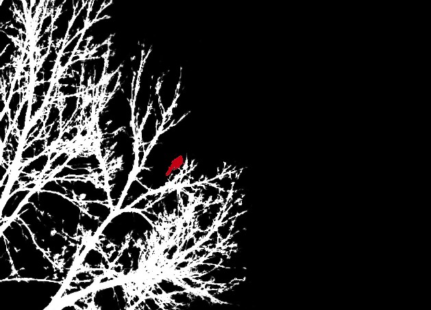
I am almost positive that this photo will not fare well in this challenge, but I am submitting it because I think it will at least be very different from other entries, and I wanted to share the first rated photo on this site for this particular Poloroid camera. The camera is EXTREMELY limited in its capabilities, and I used the digital 3.2 zoom to capture the original, which is in my opinion an incredibly poor quality shot. (This camera does far better with no digital zoom for landscape-type shots taken from afar.) So I relied VERY heavily on post-processing to create what I feel is a completely new, original work of art. I don't feel that this violates the spirit of this competition, though, because this doesn't really change the typical person's perception of the composition. I just used liberal coloration to highlight those elements in a new fashion.
(Still, I must say that I would not be terribly surprised if this was my first DQ on the site, simply because I can see bipolar reactions to this by general voters and the Site Council alike.)
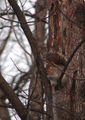
Since the colors were HORRIBLE (camera's fault), I immediately two-toned the composition, then cropped to get this perspective and applied an unsharp mask to get a stronger profile. Then I burned the branches and the crow's outline before dodging to pure white the entire sky (which was an ugly shade of blue) behind the branches. Inverted the colors to get this effect, and then dodged the branches some more. I feared that the bird wouldn't draw enough attention since it looked like just a "lump" on the branches, so I used a color replacement pen to make the bird red, in keeping with the bold artistic statement of this composition.
The final effect is closer to a work of modern art than a photo...and for that reason alone I think this will fare poorly in the challenge...but I remain unfettered in my decision to share it, if for the comments alone. (FYI, everyone, I did choose to classify this as "digital art" as its first gallery choice.)
Okay let's see what the voters do with this one!
Statistics
Place: 211 out of 218 Avg (all users): 4.1502 Avg (commenters): 4.2917 Avg (participants): 4.1089 Avg (non-participants): 4.1818 Views since voting: 1621 Views during voting: 437 Votes: 233 Comments: 30 Favorites: 0
I think this pic. is really cool. I don't agree with your low placement at all. I think it looks really nice. I really think you should have gotten an average score of 7 or 8. Good job!!!!!!!
A nice bold try at trying something different. It does keep my interest for the reason I try to look harder, so that's good. Title a side, with the challenge theme in mind I do get it's a cardinal but otherwise I wouldn't have gotten it , I think.





 Add photograph to your favorites
 Add photographer to your favorites


 Photographer found comment helpful.


