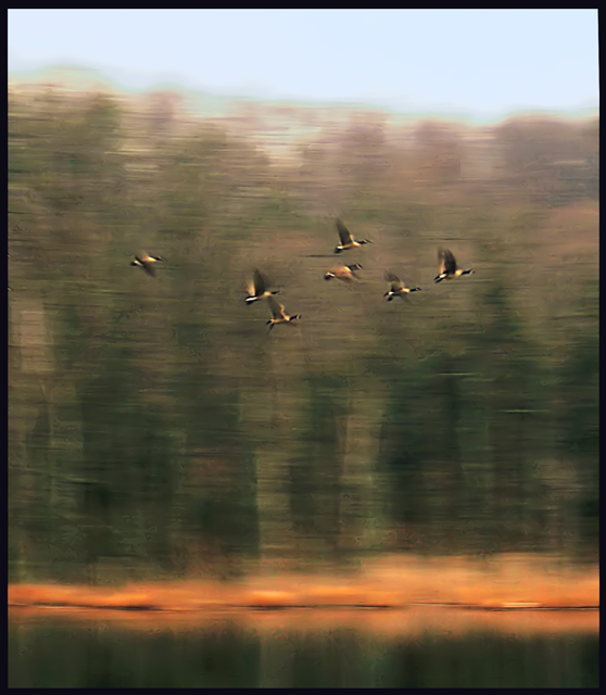
This is one of those photos where at first I liked, then I didn't like it, and now that I look at it a bit more I like it. Take that dribble for what it is worth. :) One thing I do love, is the colors! I think the "texture" is what bothers me, sometimes it feels right sometimes it feels wrong. It is one of those photos that if I saw in a gallery I would look at for hours. Standing 2 inches from it, then 10 feet away, then 2 inches, etc. If the challenge was "Interpretive" an easy 10; "Motion Panning" I'd give it a 6.
Quiet, muted, and understated; that orange glow at the waterline makes it sing. 'Twere me, I might indeed crop off the sky - put the geese closer to the top and keep just the dark tones.
Ah, going for the same feel as Melethia's Ode to Joy? I'd say you did quite well. The colors are muted in comparison, but this accurately reflects the feel of winter. Good for you for going for a subject that doesn't hold still in the frame - the blurred wings just help convey the sense of energy and motion. Add another favorite. :)
On a scale of 0-2 in five different categories: Image quality - .5. Composition - .5. Lighting - 1. Post Processing - .5. Choice of Subject - 1. TOTAL SCORE - 4
Lovely painted effect on this. I would probably have cropped down the sky as it lacks any texture so doesn't really add, and I'm not sure the ducks are big enough or clear enough to really demonstrate motion panning. Still a lovely capture though.







 Add photograph to your favorites
 Add photographer to your favorites

 Photographer found comment helpful.


