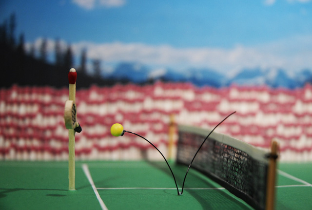
I just had to try this challenge, I knew right away what I was gonna do. Too bad I didn't realize how much work it was going to be. It took a very long time to create the "set", but it was worth it. I still giggle when I think about it. Hope you like it.
Curves a bit for more contrast and resized as per DPC specs.
Statistics
Place: 18 out of 248 Avg (all users): 6.2371 Avg (commenters): 7.2963 Avg (participants): 6.3625 Avg (non-participants): 6.1491 Views since voting: 1335 Views during voting: 392 Votes: 194 Comments: 31 Favorites: 1 (view)
:) this is a very funny and a very clever idea! I kind of like this DoF, nothing ditracts me from the main subject(s). I agree with ken (Art) though: it would be cool to see the "face" of the "trainer"/player. congrats on your PB!!
Way to go, Al! Congrats on a personal best. I do know how much work goes into shots like this. Worth the effort probably. I think a few simple improvements could have pushed this into the top ten: turn the player & racket more toward the camera and slightly deeper DoF.
Thank you all for the wonderful comments. I felt that the DOF was a tad shallow myself, but unfortunately I made my set a bit to small to work with so I had to be in tight. Also, I wanted to show the racquet more but I didn't want to show the wire that the ball was glued to more. Oh well, I learned a lot from this challenge and your comments. My best score yet, so thanks.
Neat idea, but the "match crowd" is a little distracting. Not sure what you could have done to improve it though as the depth of field is already pretty short.
This is really creative! Love the bokeh background, lol. Good lighting, too.May have turned the "player" a touch so you can see the racquet a bit more. Cool shot! (No punn intended!)
Very original idea. I'm almost done laughing, so your vote is in. . . 8, because I would have liked to see a slightly longer DOF to bring the 'crowd' more into focus, and to show us the net in better detail.
Very clever! It's a cute idea and looks great. The only change I would make is to turn the "player" clockwise just a touch more but I'm sure you had your reasons why you didn't (perhaps the racquet didn't turn out good enough?)
The clear focus on the ball and player are a wonderful contrast from the background.
wow - what a setup. You seem to have put in so much effort and yes it looks like worth it. Very nice and absolutely creative. The spectators in the background are large enough so it seems like an important match :). I think you may have made it look still better by turning the player a bit more so that the racquet was more visible. The concept of the movong ball is just brilliant






 Add photograph to your favorites
 Add photographer to your favorites

 Photographer found comment helpful.


