Raish,
I thought the concept was quite clever, actually. I gave it a 6. The blown highlight no doubt hurt you, and I agree with Darren that it has the appearance of being thrown together rather quickly. Still found it an interesting entry - and I'm not adverse to giving out 2's or 3's at times, so a 6 is not my "bad" score.
Thanks for commenting here, Darren. It's not easy to say something about efforts that remind of nothing more than a thin soup of shite.
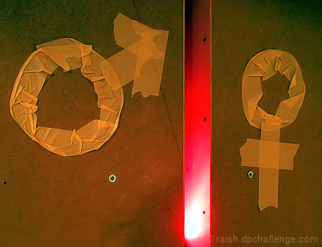
It is altogether too hastily thrown together. The idea was to provide something conceptual, with the red void in between the two surfaces representing the 'battle of the sexes'. (Said battle is, of itself, mostly conceptual, I think). More blood and gore and more contrast in the battle zone might have helped a tad.
I don't know if you do any gardening, but it's often useful rule of thumb to say 'you don't nurse sick plants'. I think this one's for the compost. I very much appreciate your taking time on it though, thanks.
hi
Having looked at other shots you do have some quality images but this seems to be so rushed and poorly constructed. the blown light adds nothing to the image and the symbols looked to be 2nd rate at best.
Can you explain the set up and thinking behind the shot as i maybe missing something you were after.
I'm sorry but this doesn't even look like you tried to make a good image. This really doesn't convey the theme well and it doesn't look like there was an attempt to even make the symbols look good.
I find the workshop background, tape and plastic to be very 'shoddy' in the concepts execution. The major blow out is extremely distracting. Overall does not appear a lot of thought or effort went into taking this, except to just take a photo.




 Add photograph to your favorites
 Add photographer to your favorites


 Photographer found comment helpful.


