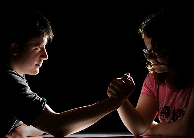
The idea was a weedy little girl armwrestling a big strong bloke and winning. Not entirely sure this gets the point across as i had hoped, the "big strong bloke" model doesn't really look all that macho, and you can't really see the girl's face either. Still, i'm pleased with the lighting and background. Light was a single wireless flash above and off the the right, pointing at 45 degrees to the camera. Backdrop was just a black cloth on a support. Took absolute ages to get the framing and expressions anywhere near to how i wanted them. Managed to get the hands on one of the thirds though as intended, quite pleased with the composition overall if not the subject matter. So few entries in this challenge i just couldn't resist entering something.
Editing:
Bit of a contrast boost to make the blacks really black, some dodging and burning to tame the extreme highlights and darken the female model's hair, cloning out some bright dust specks caught by the flash, crop, resize, sharpen.
Statistics
Place: 32 out of 90 Avg (all users): 5.5677 Avg (commenters): 7.2000 Avg (participants): 5.5385 Avg (non-participants): 5.5748 Views since voting: 1511 Views during voting: 468 Votes: 266 Comments: 18 Favorites: 1 (view)
The first three parts of this critique are written based purely on examination of your photo. "Final thoughts" is written after reviewing your score, photographer's comments, and voter comments.
TECHNIQUE Very cleanly focused and sharp. I think the backlight is wonderful and love the flat black background. l think that even more careful attention to lighting would have paid off. The woman's face is not as brightly lit as the man's, which, coupled with her hair, tends to hide her features a little too much. Great job managing the colors though: skin tones are beautiful as are the muted colors of the clothing.
COMPOSITION The arms are steeply tilted in her direction, which may be a way of indicating that she's winning the contest, but for me, it would be more effective if the composition were perfectly symmetrical: faces on the edge looking in, with the clasped hands dead center, staring into each others' eyes. As hot, it has an unbalanced look from the standpoint of the slanted arms, as well as the fact that his facial expression is full of meaning and emotion, while her face is largely hidden, though it looks as though she's looking down at the hands or table. I would probably also have experimented with a tighter crop. As shot, I love the fact that his face is the focal point of the photo. He's got a look of amused determination that is priceless.
EMOTIONAL IMPACT This is a shot that has boundless emotional potential that is only partially tapped. As suggested above, more exposure on their faces and careful attention to composition would have improved this shot considerably. As it is, I like it a lot, but can see that it could have been much, much more.
FINAL THOUGHTS I'm glad you included the fact, in your photographer's comment, that you were intentionally aiming to get the clasped hands on a third. That explains the symmetry I noted above, though I think I still like my idea of perfect symmetry more - seems in keeping with the challenge theme. You also noted the problem of her face, which I full agree with as well. I love the fact that people loved your lighting, I like it as well. People also had some different takes on the composition - it just goes to show that you had a great idea and got people thinking with your take. Nice score too, but I bet you would have pushed 6+ if you'd really nailed the composition and gotten right into the faces. Nice shot. I enjoyed studying it very much!
I think this would be a better image if they both were putting some effort into it. I do, however, like that she's beating him with a technique of proper leverage thus she can use her back, chest, shoulder and arm to defeat his "curling" motion which uses essentially just his bicep.
I think this is my favorite in the challenge. I love the lighting and that his arm is extended more than hers - somehow makes it feel like a generous and loving struggle. Back to bump you up to 9 and adding to favorites.
Too much space between the players. Oversharpening left his nose looking like a set of stairs. Too much shadow, not enough back light on the top, coming down.
Otherwise, great focus, good concept.






 Add photograph to your favorites
 Add photographer to your favorites

 Photographer found comment helpful.


