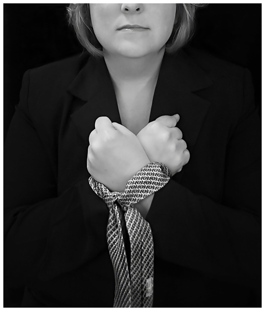
Half face inspired by the work of tmph. I wanted it to be "any woman" so half face worked - plus I think I look much better this way! :)
The rest of the shot is inspired by a former employer of mine. Please don't insult me with special treatment based on something I have no control over but don't let it hurt me either.
Crummy indoor lighting resulting in very low shutter speed & yucky shadows. I couldn't do my usual outdoor thing due to very dark rainy weather the entire weekend - bleh. Lit with a desk lamp, ceiling fixture, and what little light was coming in the window. Shot in Raw - raw conversions. Elements - crop, levels, hue/saturation, neat image, unsharp mask, dodge, burn, minor cloning, blur, border, save for web.
********************************
Top 20 is always nice. I know it was a little soft. Shutter speed 1/10 was all I could muster with the very poor lighting conditions. Crummy rain! Thanks for the comments!
Statistics
Place: 18 out of 90 Avg (all users): 5.9927 Avg (commenters): 7.3750 Avg (participants): 5.6000 Avg (non-participants): 6.0807 Views since voting: 1334 Views during voting: 443 Votes: 273 Comments: 24 Favorites: 0
This was the only challenge I managed to vote on while away. Gave this an 8. Thought the image was clear, the message simple and to the point. Definitely a strong b&w Aimee. Top 20 is a fantastic result, congrats again!
Man, it sure doesn't look soft to me! To me, it looks about as clean and crisp as you can get! And the concept is awesome! Top 20 or no, this is ridiculously underrated!!! I like the score your smart commenters gave you much better!
one of the best i have seen. I would have likes detail in the blacks, you probably do, but it doesn't translate well on the internet. Also you light is a little flat and would have like more drama. I am just being picky. Overall the concept is really wonderful and the execution is also pretty good.
Not only the content/message is strong, I also like the way this photo is build up out of a few simple elements with a lot of negative space. Highest vote so far.
Now look what you did! You went all serious with your entry. Now I can't even crack a joke here. :P I'll just say this is one of the best in the challenge and leave it at that. Good luck!
A great image that may have benefited from a background fill light to help keep the jacket from blending into the background. The tie's pattern makes it look oof which is distracting. Very nice choice of concept.





 Add photograph to your favorites
 Add photographer to your favorites


 Photographer found comment helpful.


