Not really a place sacred to me, as I'm Jewish... but not religious. I'd say I was more into spirituality. I believe everywhere is sacred.
However, I thought I'd go for the obvious challenge interpretation.
Statistics
Place: 10 out of 109 Avg (all users): 6.3472 Avg (commenters): 7.2353 Avg (participants): 6.0405 Avg (non-participants): 6.6714 Views since voting: 2042 Votes: 144 Comments: 22 Favorites: 0
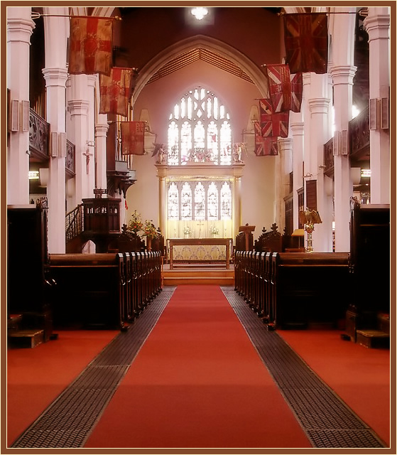
Very beautiful photo. The color tones are wonderful and the DOF is terrific. I like how you captured the light coming through the window, yet it doesn't overpower or wash out the photo...nice job.
I think this is an excellent indoor architecture study. The lighting you have to work with here is actually very nice. I like the way the brighter light in the front window of the church seems to be symbolic of the light of a higher power :) I think you also did an excellent job of keeping the perspective distortion in check. Verticals usually seem to tilt inward because a photographer will not keep the film plane parallel to those verticals.
I don't think there is anything you can do to improve this image without employing a much wider angle lens.
This is a very pretty shot, the runners on the side bringing you into the shot and taking you to the alter, the almost mirror image in the cropping and the mystical haze on the front window. The colors are very vibrant and bold, maybe just a bit too bold? It seems it should be just a bit more subdued? and the cark line across the carpet in the lower part is abit distracting. Started with a 7 am going to an 8
I quite love this shot, and after coming back to it several times, have rated it higher. The great repetition of lines and patterns gives this shot a lot of strength. I like the lighting, and the somewhat "soft focus" around the stained glass windows. The photo definitely represents something that is sacred to me, evokes the feeling of peace that I get in a church. The only thing that detracts from the shot, for me, is the overwhelming expanse of red carpet at the bottom of the shot. I would love to have seen some of that cropped out; it makes the photo feel somewhat unbalance to me.
good composition, but I'd rather have seen the upper window not cropped. Good exposure given the conditions too. some people would have added some focal point or needed interest.
Great photo and beautiful building. DOF, contrast, color.......it works for me. I thought I'd like to see less red carpet, but again......it does show the depth of the room. I like this one very much..
Neat and tidy. Very balanced, wonderif it would be more interesting less balanced? But that wouldn't be Brittish! I like the difuse glow from the window. I would have included less of the floor and more of the ceiling.
Wonderfully composed, but seems a bit over-exposed due to the fuzzy windows. I've had better luck under-exposing photos then bright/contrast in PS or PSP. 6





 Add photograph to your favorites
 Add photographer to your favorites

 Photographer found comment helpful.


