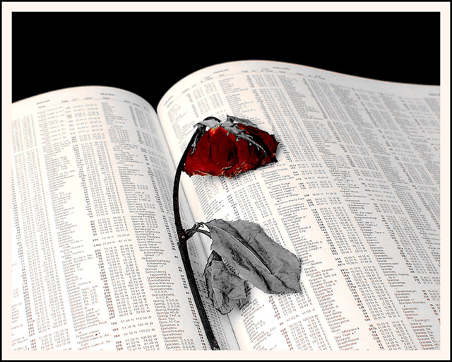
Wow, this has potential. Put that flower up against the Wall Street Journal's pale yellow stock pages and this would've won the contest by far. I'll still give you a 9 for being pretty damn creative. I've never thought of this before.
interesting effect, but it would have worked better if you'd taken the saturation out of the pages as well - there's a warm tone coming off them as well. i'm not sure i'm fussy on the black negative space either. would all book would have worked better to fill the frame?







 Add photograph to your favorites
 Add photographer to your favorites


 Photographer found comment helpful.


