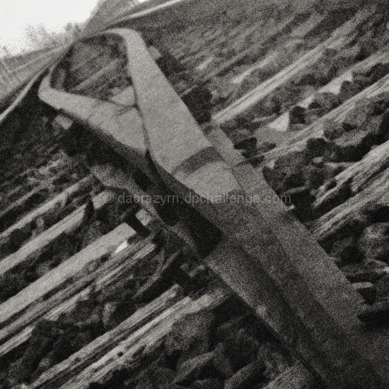
Railroad track switch line, taken in infrared and converted to black and white, noise added, and toned. Would like to have mirrored it and made it look like the infinity sign. To follow.
Photos4Aidan
Statistics
Place: 92 out of 104 Avg (all users): 4.8815 Avg (commenters): 5.3846 Avg (participants): 4.6571 Avg (non-participants): 5.1231 Views since voting: 1108 Votes: 135 Comments: 14 Favorites: 0
Very fine point of view here and nice use of B/W and contrasts. I like the noise here, though you may have gone just a lilttle bit overboard. Still, nice work.
Composition
This is a good subject. Nice composition. Your selection is germain to the topic, it conveys a visual aspect of continuation (as the tracks go past the viewer's ability to discern) and your choice to turn the photo on this angle allows you to get more of the rails in the photo as well as providing a different view of a fairly common subject. This speaks well for your creative eye. The tracks are a little off center on the diagonal in the top lefthand corner but this isn't much of a distraction. The photo like it was either at a high ISO with a lot of noise or perhaps an infrared (IR) shot. The photo has a high grain that can contribute to many photos but in this case it is a distraction. In the immediate FG the subject could be much clearer and the level of graininess cuts down on the viewer's ability to perceive the rails distinctly before going very far back into the photo. While that is a desired effect I think you would want to create it with a clearer photo and the depth of field (DOF) rather than the graininess of a high ISO or an IR shot as the latter selection affects the whole composition while the DOF choice affects only the subject as it interacts into the BG.
Color
Nice choice in using B&W. It helps to cut down on visual competition. Often due to the objects in a photo having a higher or lower albedo, B&W can be distracting. With your selection everything seems to have a common level of reflection and, thus, not much seems to overpower the rails. The wooden railroad ties in the FG provide a little contrasting competition (especially since they are at right angles to the "infinite" rails).
Lighting
You seem to have good lighting here with no hot spots.
Focus
Focus is okay on this photo but the DOF could be a little larger. The effect given by the rails going out of focus is good and provides another visual clue to the "infinite" but having a slightly larger DOF wouldn't have cut into this too much.
Overall
Good subject, good interpretation. The graininess, whether by choice, oversight or limitation, is a distracting element and it is for that reason I lowered the score on an otherwise appropriate and artistic submission for this challenge. I rated this a 7 with a higher score in artistic nature. It just falls short technically to me.
Not sure about this. The noise doesn't bother me at all, in fact I like it, and the composition is fantastic. I just think it needs more contrast to make it pop. Still up there with the better track shots though.
Not sure if the grainyness is on purpose, but I think it is over done a little. Can't get a very good sense of perspective or a feeling of infinite. I like the angle or tilt a lot! And maybe crop out the bottom up to the point where the top of the track has the lighter shade. Great idea.
Like the composition. and the point of view angle.
There is so much grain, I can't help but think you added it. The problem with adding grain is you take a hit in sharpness. With this picture, it's a toss up. I think I would have liked to see it sharp. You might consider volunteering it to the post processing thread. It would be interesting to see different treatments.
Interesting grainy effect - takes our minds of the details (which could be distracting) and onto the whole of the photo - the abstract infinite. Wish the vanishing point came exactly in the corner - it is offset to the right.
I like the gritty feel of an industrial subject. The pattern of the track is good. I also like the combination of angle and bottom heavy composition. Very good, 8.
This is such a dynamic shot! From the great angle/composition to the grain, I think this is one of the better images in the contest. BTW, I feel the black and white works perfectly. Great shot!
this image is almost lost in the grain. interesting choice of angle. i would have liked to see it tilted just a little more to make the white corner in the upper left more symmetrical in its triangular shape. it probobly would have helped make the track seem more like it was going into infinity as well.







 Add photograph to your favorites
 Add photographer to your favorites


 Photographer found comment helpful.


