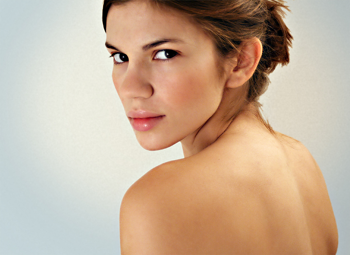
So this one had a loott... a loot of editing. I don't have real lights so the set up was 2 of the brightest light bulbs covered with paper (a suggestion I saw in the forum).
So here were the steps...
- Boosted the Cyan and Blues
- Removed Blemishes
- Desaturated the reds a bit
- Unsharpen Mask
- Autolevels 65% Opacity over my color edit
- Neat image
- Added a mostly desturated Guassian Blur on Soft light
- Final tweak of the eyes
- Removed background and replaced with a slight cream gradient, added speckles then blurred them
- Blueish vignette added
The title is ironic to me considering the amount of editing I went through... ok.
This is hard but I'm going to post the original... blemishes and all. Cus I just looked at THIS last night so I'm feeling it's neccesary...
this is definitely the simplest and the most beautiful of your SPs.
btw you should flaunt your jaw line a bit more (with the use of lighting and camera angle) in your SPs :)
Awesome work. The pose and the bare shoulders and back with that stare are oozing sensuality. A tad over proccesed on the but good job getting the fashion magazine look.
You look great (in the original!!)
The original looks fine, but you did a terrific editing job and turned it into something from a fashion magazine. I particularly like how you changed the background to be brighter in the center, drawing my eyes there.
GREAT lighting! Great pose too. It's a little odd to me that the focus is actually stronger on the further eye, but it's a lovely portrait any way you slice it. Nice...




 Add photograph to your favorites
 Add photographer to your favorites


 Photographer found comment helpful.


