Just stellar! I like this perspective instead of another glittering touristy snapshot. It's mysterious and breathtaking. HIGHLY UNDERRATED!!!!! I think it's perfect exactly the way it is, too.
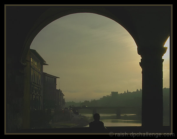
This is a wonderful photo. I really like the choice of colors and framing done here. Not sure if the color tint was added in post or natural but it really give it a good vibe. The composition is near perfect, though I think the sun coming off the column seems a bit harsh. Also, I think it is a tad over-sharpened for this resolution as the individual and the top column shows definite signs of jaggedness. Still, a terrific photo!
P.S. Much better than anything I was able to grab out of Venice.
Raish, I love this photo and think you deserved a much higher score. It is moody and lovely. I suspect it would look great as a very large print. I agree with Julianne that you chose a wonderful frame, too.
You deserved a much higher score IMO. I gave this shot a 10 (and I was very stingy with the 10s in this challenge, since there were so many excellent shots. (Didn't want my aver-score-given to wind up in the 9 range. How stupid would that look?)
I love the mood, the muted colors, the composition. It has the feel of a classical painting. The frame enhances it nicely too, although I try not to include my feeling about the frame in my scoring of the image.
Beautifully subdued and worth lingering. I do like the partial arch on the right by the way - it adds just enough to balance the picture in my opinion.
5.8?!? Yet another team suck entry I just can't believe scored where it did. This is BEAUTIFUL.
My one internal question is how I feel about the bit of arch on the right. With it, the image tells me there's more to the scene just over there to the right, so it engages me. With it cropped out, the framing just feels so sweet. Both good results. :)
The subdued tones work well here.
The person sitting there adds everything to this shot and one can only imagine sitting there, thinking, wondering, absorbing the day.
Well done!
I think this would be a stunning shot if the lighting were not so bad. It looks like you tried to boost the brightness on this, but it has given the image a grayish tint.
You know...this is a beautifully framed and cropped picture....but it definitly lacks contrast which takes away from the beauty...to bad. Maybe you can fix it?
I love the mood of this with the guy looking off to the distance! I think I may have cropped it so that only that one center arch showed, but that's certainly just a matter of my personal tastes -- not gospel on what makes a photo better. I really love it just like it is too!
Best: brought back memories, the oh-so-peaceful tones...about 5 buildings on the left is where I stayed!
Worst: border-although i like it, I do believe it distracts....no absolute black point...






 Add photograph to your favorites
 Add photographer to your favorites

 Photographer found comment helpful.


