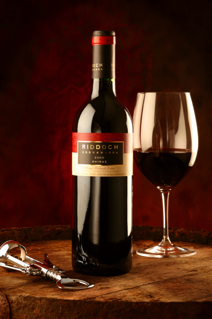
I have to say that this shot was one of my favorites…a classic still life image. There’s obviously a lot of attention to detail in this image, from the beautiful rich, burgundy background to the (what appears to be) authentic wine cask the subjects are sitting on. The highlights in the stem of the glass are wonderful, they make it stand out so strongly against the dark background.
The only thing I could possibly critique in this shot is the fact that the highlights on the bottle and glass seem ever so slightly hot, but not to the point of being blown out. I realize that when dealing with glass, slight hotspots are impossible to overcome but that’s about all I can see that is remotely distracting (to me). Some may feel the corkscrew shouldn’t be cropped, but I feel it works well as it is.
This is a fantastic shot that in my opinion, deserved a higher placing.
Nice complimentary background both in terms of surface and backdrop. Lighting strong but resulting highlight shapes work reasonable well. Would prefer corkscrew not to be cropped.
Now this is a still life photo exactly as I would have expected it. This is amazing, a wonderful set up. I can also see that you have done this kind of stuff before, the lighting is perfect. No reflections or blow outs at all. This has been done professionally, good on you and congrats on a top placing!
It's a nice arrangement and a pretty wood-grain table. I would have liked to have seen the translucence of the wine in the bottle and glass - that's one of the beautiful things about colored liquid. Perhaps a second light behind the setup would have brought this out.
I rescind my comments, but not my opinions. This looks like a catalog ad for a bottle of Shiraz. It's a great wine. But I would focus more on what this subject can do for you in terms of design than in terms of eloquence. Red wine always looks good with musty, weathered wood. If you were to focus on, say, the wine glass, crafting a mood with your lighting, taking a unique angle, I'd say you'd improve in terms of design. Right now, there are no elements of design, only elements of marketing.
this is a great photo only one wee thing is the corkstrew being cut off and a touch sharper 8/10 - just copied this a using microsoft photo editor and sharpered it by 1 makes it a better photo
It's so hard to compete against you guys with your fancy set ups, studios and lighting. Great picture, looks like something right out of a procut catalog.
Simple effective arrangement, though showing the removed cork would have been a nice touch. The reflection of the photographer in the glass is a bit distracting.
the cork screw could go and be replaced by the cork. I like the abstract in the wine glass VERY MUCH it looks like wine being poured. Very nice effect.
excellent excellent excellent....... Looks straight out of a magazine.. 10+ The left side of the glass is a bit weird with the reflections, but that's a major pain to get perfect..
A good combination of warm colors in this traditional setup. A bit too many reflections, especially the one in the glass. Some black sheets could have prevented this.
Nice background, wonderful tones, the lighting is good, no obviously bad reflections. The barrel, I think, as a table top goes well with the rest of the theme. Only negative is the crop of the corkscrew. Nice classic still life.





 Add photograph to your favorites
 Add photographer to your favorites

 Photographer found comment helpful.


