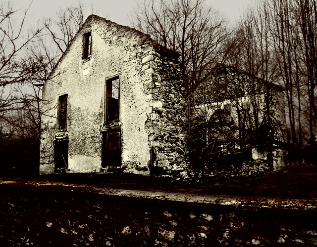
I did a lot! I used calculations to convert to black and white. Then I converted to tritone. Then I converted back to RGB. Then I used masks on curves to give different parts different curves. Then I used selective color to make it warmer (and less like a tritone. am I going in circles?) Then I used a very intense curve just for the fence and house. Then I dodged and burned the fence in the foreground to give it a little more interest. Then I sharpened, and used a mask on that so only the front of the house would be sharp, and the top of the fence. I'm exhausted. All this just to get another crappy score. Is this on my list of objectives??
In camera, I used P mode but underexposed one stop. I find that gets better sky.
Since I worked so hard on this, I'm going to ask for Critique Club to see what somebody thinks about it. If you don't like it, please give me suggestions, particularly on exposure and processing.
NOTE: The powershot does Automatic ISO, and it doesn't give the ISO in the EXIF, so I had to guess the number in order to submit to Critique Club.
==============================
post-challenge: ok, so I did not get a crappy score. but if I could predict my score, I wouldn't suck!
Statistics
Place: 40 out of 219 Avg (all users): 6.0804 Avg (commenters): 5.8182 Avg (participants): 5.8523 Avg (non-participants): 6.1818 Views since voting: 1580 Views during voting: 376 Votes: 286 Comments: 20 Favorites: 1 (view)
very powerful image. i look here, i look there, i am not at rest, every part of the image is singing at me. (I almost wish I hadn't seen it; all the things you did that I don't know how to do).
this is poetic, living in country with large number of devastated/abandoned buildings i can almost see you visited my country :-)
... it gives me mixed emotions ... i can be sad watching this or i can slam my fist at the desk saying ... "damn, there must me a better world out there" ... and go out, go home, go anywhere ... enjoy your life ... no one will do it for you. just GO !
Makes me FEEL. I think of my childhood in Nova Scotia. My dad had a love of exploring old abandoned buildings and farms. I can smell their old musty smells. This image also makes me think of Wuthering Heights and Jane Eyre. The technical part is way beyond my ability.
Hi Don,
Like this a lot. Gave it a 7 while voting. The tritone finish makes it refreshingly different, and the curves give a great sense of motion.
BTW - what's that about a crappy score, hmmmmm? Anything above a 6 is a great score, in my book! What you complaining about, boy?
Wow! This is awesome!! And I'm not saying that just 'cause you're Fearless Leader!!! I like the tone-mapping effect, I believe it's called. Or at least that's what I understand the pastelizing effect...what looks like antiquing. You do have good sky but I fear that the definition in the wall suffered though that may have been intentional. The whole dirty, gloomy look works really well with this old falling in house. I wonder why it didn't fare better except that if you look at it quickly, you cannot get the effect......it's possibly too subtle.
I am too tired from reading your comments to take in the shot...will have to come back later...
edit: I am back...I think this has the feel of a painting...the dabs in the foreground..inky looking sides of the building...maybe that makes it an ink drawing...oh no you are starting to realize I don't know what I am talking about...ok let me say this...the darkening effect of the tritone works well here, as the key bits of info are all present, and it adds a stark look to the overall shot...you did a nice job with the foreground, giving it a painterly look (can't blame me for trying...)...
ahem...cool looking shot
The thing that strikes me, after reading what you wrote, is this doesn't look all that "processed" to me, which is a good thing. It does look old, like it was taken in an era long before Photoshop. The picture itself engenders a bit of sadness and a sense of what once was never to be again. Dare I say it? This is a fine editing job.
I like the tones and processing on this. Works well for this photo. The title you've picked wouldn't have been my first choice. I associate that title more with a person rather than an object. Just my take on it. Good luck in the challenge.








 Add photograph to your favorites
 Add photographer to your favorites

 Photographer found comment helpful.


