also try working the curves to remove that color cast... tutorial in tutorials section. blue channel is opposite to yellow, so push the blues and reds channel is opposite to Cyan... Play with the red/cyan after tweaking the blue/yellow.
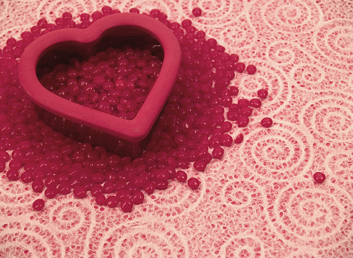
What a really cute idea! I love the lone red one kind of running away lol... Are you going to use it for stock? I have to chime in the same thing the others said - the reds and whites need more contrast to make things stand out. Nice job!
That would make a good Valentine's Day card. It appears to have a "pinkish" cast, which works okay, but my eyes really seem to be making it red and white.
I like the symphony of reds and the lacy background is very pleasant. The lighting feels very flat - better addressed when the photo is shot, but can be played with in post processing using curves, selective colors, shadow/highlight or some combination of the three. The crop on the left feels awkward to me - I'd rather see the jelly beans flow past the boarder of the photo on the left AND the top or have lacy space on both sides.
Seems kind of washed out. I like how this makes my hungry for some candy but other than that I don't really see the significance. Not sure I like the composition and crop.
Nice concept, however I find the result comes across very flat and dull. Would have liked to seen the reds "punched" up a bit as well as a little sharper. Good Luck.
I like your choice of composition but feel this would have been better if the background was white rather than patterned. The lighting, to me, seems a little flat and the heart doesn't seem pin sharp (just my humble opinion) but I do like the idea you had here :o)
Nice concept. Can't say I care much for the yellow color cast... If you could get the white lace white, I would guess that the rest of this picture would really come into its own.





 Add photograph to your favorites
 Add photographer to your favorites

 Photographer found comment helpful.


