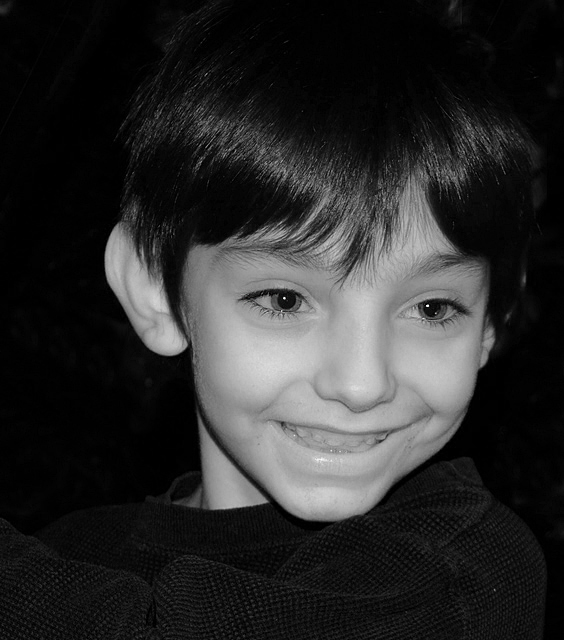
VERY nice! I love the way you have captured the way his face just lights up with his smile! Great detail, crystal clear pic......good negative space behind and the light is really good. I like the dark color of the sweatshirt and the detail so crisp that the pattern of the material breaks up the smooth surfaces elsewhere. Nicely done!
I'm partial, because I think he's a darn cute kid and he has the most gorgeous eyes. Good even lighting on his face, nice catchlights and pretty good B&W conversion. I really like the choice of dark clothing and a dark background - highlights your subject very well.
Hey - I know this little boy! I think had you caught him looking right at you this image would have really been great - not that it isnt good right now. Great smile and nice detail in his eyes.
i think that if you spent some time working with the black and white levels in this it would be a lot better. the gray eyes and teeth make the coloring on this pretty disturbing.
Why did you put him to the right of the photo? He looks to the right, and instinctively i would say that the look needs more space on the right to give it more impact on us. Now you break the look in my opinion.
I do like how the black hair goes into the background, connecting the two. At the same time the light gives us enough to feel the texture of the hair. The same goes for the clothing.. nice detail because of good use of light there.
However i don't like the light on his face, meaning it's good on his face, but not eyes or vice versa. The white of the eyes looks darker than the skin, which doesn't feel right. Maybe just a slight lightening of the white in the eyes? Also you have chosen for a very straight forward light, which in this case also means that his ear gets a lot of light. It's a secondary attraction-point because the hair cuts it off of the face and thus you get two points of interest, damaging the impact of the face. If you had chosen to put your light slightly to the right of you, the ear would have been in the shadow and attract less attention.
Good catchlights! Skin seems to be more on the grey side, this could be boosed in photoshup>curves, the hair also bends too much with the background....unless this was your intent?







 Add photograph to your favorites
 Add photographer to your favorites

 Photographer found comment helpful.


